Neutral Bathroom Tones: Warm, Calm, and Timeless Palette Ideas
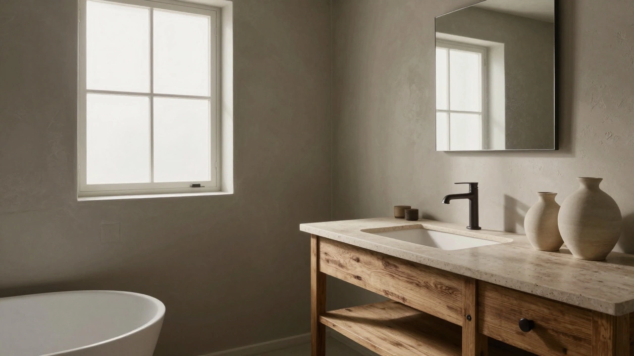
When you think of a bathroom that feels like a quiet escape, you’re probably picturing neutral bathroom tones, soft, understated colors that create calm and cohesion in small spaces. Also known as warm neutrals, these shades aren’t just trendy—they’re the foundation of spaces that feel peaceful, clean, and enduring. Unlike bold colors that demand attention, neutral bathroom tones work quietly in the background, letting texture, lighting, and materials take center stage. They’re the reason your favorite hotel bathrooms feel so relaxing—even if you don’t know why.
These tones aren’t just white or gray. The best ones have warmth—like soft beige, creamy off-white, and muted taupe—that avoid the cold, clinical feel of plain white. Designers are moving away from cool grays (which dominated for a decade) and toward colors that mimic natural materials: stone, linen, and weathered wood. warm neutrals, colors with subtle yellow, red, or brown undertones that feel inviting rather than sterile are now the go-to for bathrooms because they make small spaces feel larger and more inviting. They also pair effortlessly with natural stone, brass fixtures, and woven textiles, which is why you’re seeing them everywhere from modern apartments to country homes.
What makes neutral bathroom tones so practical is how they handle light. In a north-facing bathroom with little sun, a warm beige lifts the space. In a sun-drenched room, an off-white keeps things fresh without glare. And because they don’t clash, you can swap out towels, rugs, or accessories seasonally without repainting. This flexibility is why they’re the smart choice for long-term design. You don’t need to chase trends when your base palette already feels timeless.
These tones also make your bathroom feel more spacious. Dark colors shrink a room; bright white can feel harsh. But a well-chosen neutral—like a soft, dusty taupe or a creamy oatmeal—creates depth without weight. It’s the difference between a bathroom that feels cramped and one that feels like a retreat. And because these colors are so adaptable, they work whether you have a tiny powder room or a large master bath with a freestanding tub.
You’ll find plenty of real-world examples in the posts below. From how to pick the right shade of white for your lighting, to why beige is quietly replacing gray in 2025, to how to layer textures without adding color—each article breaks down what actually works. You’ll see how the 3 color rule applies to bathrooms, why neutral curtains can extend into bathroom window treatments, and how flooring choices like luxury vinyl plank can tie into your wall tones. No fluff. Just clear, practical advice from people who’ve done this before.