Picture opening a closet or walking into a living room that was last decorated before your first smartphone hit the shelves. Is it an awkward trip back in time, or does it feel surprisingly right, even now? That’s the power of certain colors. They defy trends and still look fresh after decades have passed. I’ve seen this first-hand, not just in magazines, but from my quirky Aunt Margot’s kitchen from 1972 (yep, she loved avocado green until her last days), to the swanky penthouse a buddy renovated last summer that used exactly zero wild hues. But what’s the one color that just refuses to age?
The Enduring Allure of Neutrals: Why They Always Work
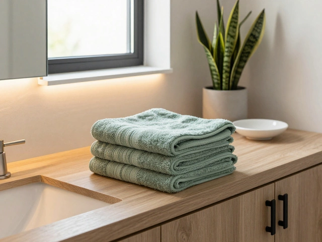
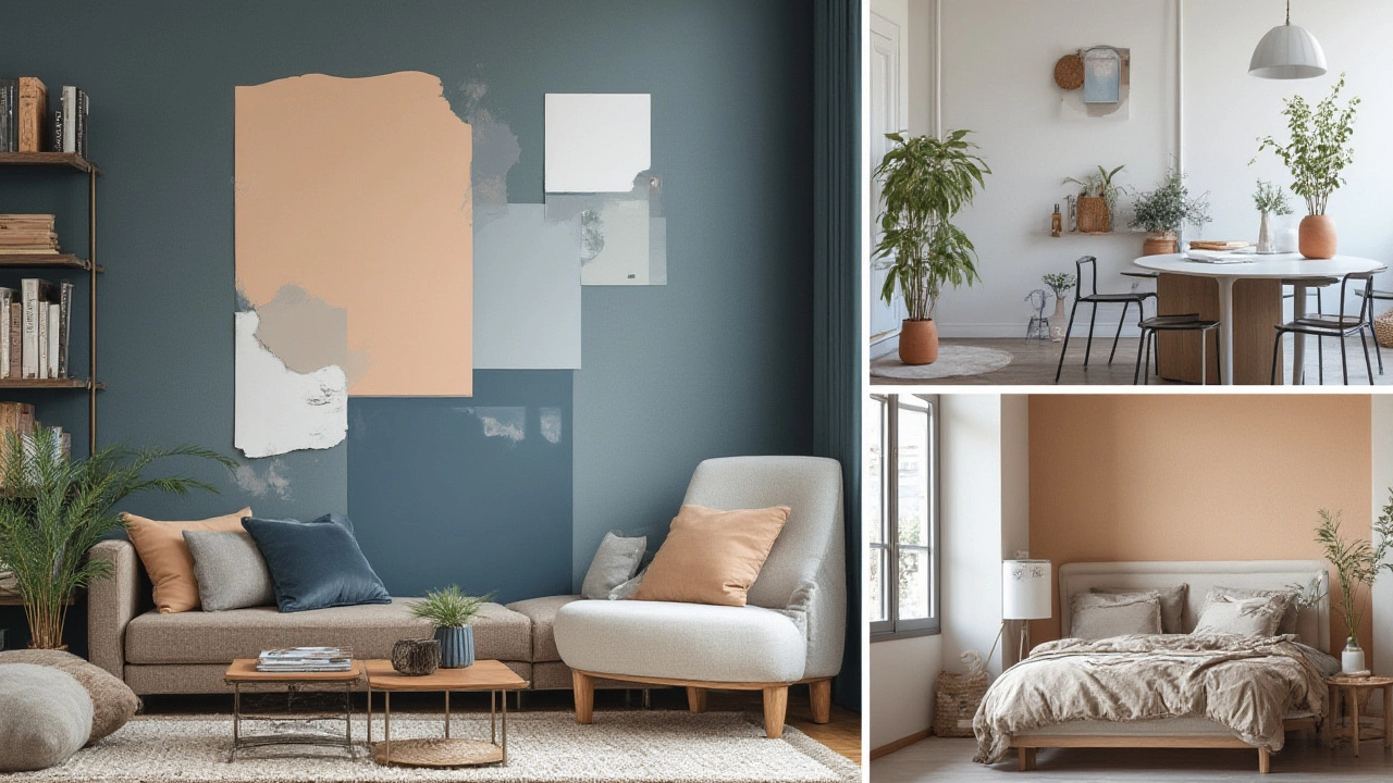
No surprise here, but neutrals are the real MVPs of timeless decor. We’re talking shades like white, beige, gray, taupe, and black. But the real king of the bunch? White. Think about it: white walls in Parisian lofts, white cabinets in grandma’s kitchen, white towels and bedding in hotels everywhere. White’s not just the wallflower of color; it’s the foundation, the canvas that never gets old.
White instantly opens up a room and bounces around natural light like nobody’s business. Plus, it’s basically the best friend of every color it meets. You can throw navy, blush, or olive-green accents into a white space and never worry it’ll clash or date itself. If you’re the type who loves swapping out throw pillows or experimenting with different art, white lets you do all that with zero headaches. It just gives you creative breathing space.
Why does it work so well? There’s science to this. White reflects all wavelengths of light, which tricks our eyes into reading rooms as brighter and larger. There’s also the psychological factor. Studies from places like the University of Texas have shown that white spaces tend to lower stress and promote calm. Retail giants know this—think how much white you see in Apple stores compared to your average crowded fast-food restaurant. That’s no accident.
Here’s a practical tip: if you’re moving, or your tastes change faster than TikTok trends, paint your walls white. It adds resale value, makes spaces feel move-in ready, and stops future buyers from recoiling at some bold color choice. And if your life has kids, pets, or the occasional spaghetti disaster, repainting or retouching white walls is way cheaper and easier than repainting an entire space a dark or complex color.
Shades That Stand the Test of Time
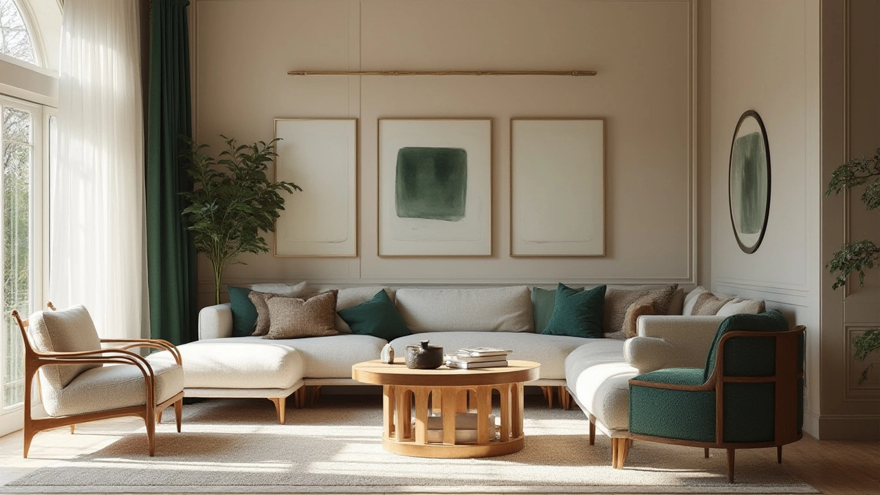
Still, white isn’t the only timeless color around. If white feels too stark, there’s a whole world of un-fussy, strong contenders: navy blue, charcoal gray, earthy browns, and soft taupes. These all play the long game with style.
Navy blue, for example, has outlasted countless fads. It’s the backbone of corporate boardrooms, crisp uniforms, and even that trusty pair of jeans that never lets you down. Navy is conservative without being boring and confident without shouting. You’ll notice that interior designers often use navy to ground a space, giving it substance and drama without losing accessibility.
Gray’s another option that’s dominated for at least two decades straight, though it comes in hundreds of nuanced shades. From steely cools to warm greiges (gray-beige hybrids)—these colors work just as well in minimalist Scandinavian interiors as they do in ornately decorated parlors. Designers love gray because it adapts to warm woods, metals, and every accent color from hot pink to emerald green.
If you want earthy calm, taupe and tan work wonders for hiding the messes of everyday life while still keeping a relaxed, inviting vibe. These foundation colors cancel visual noise and let meaningful objects really sing—think a rustic dining table or a child’s wild finger painting on the refrigerator. Taupe is especially good if you’re layering lots of textures, like basket weave, linen, or chunky knits.
Check out how these timeless colors stack up in terms of popularity for interior spaces over the decades:
| Color | Decades Most Popular | Common Uses |
|---|---|---|
| White | Every decade since 1900s | Walls, trim, kitchens |
| Navy Blue | 1940s onward | Accent walls, furniture |
| Gray | 1950s onward | Living rooms, bedrooms |
| Taupe | 1970s-on and resurfacing in last 10 years | Bedding, upholstery |
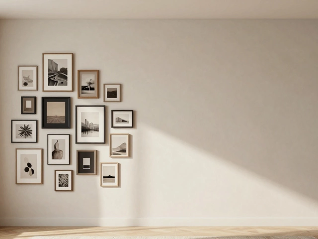
Of course, these aren’t the only classics. Black deserves a mention. It adds definition, frames a view, or delivers punch in small but unforgettable ways—matte black faucets, vintage wrought iron beds, picture frames, and of course, the little black dress in your closet.
How to Use Timeless Colors Without Getting Bored
Okay, so let’s say you’re sold on the beauty of timeless color, but dread the idea of living in a space that feels cold, like the inside of a refrigerator. The secret sauce is contrast and layering. Use white or neutral walls as your base, but dial up personality with accessories and textures. Stuff like throw pillows, rugs, plants, books, and art are cheap to swap out and instantly update a look.
I’ve got a kid (Aldric) with a love for dinosaurs, so our living room has run the gauntlet from Jurassic Park green to firetruck red throw pillows. But the white couch stays. We swap out the flash but keep the core color calm.
Mixing neutrals also keeps things interesting. If you worry about monotony, pair white with warm wood or soft gray with silver, or taupe with navy. Even the smallest details can give a room depth—a black lamp on a beige desk, or gold handles on white kitchen cabinets. Layer in textures like chunky knits, nubby rugs, shiny ceramics, and matte metals—these make solids feel rich, not flat.
Pattern works here too. A striped navy-and-white rug, houndstooth throw, or minimalist black-and-white print gives the eyes something to play with. But keep those patterns on smaller items—swapping a pillow or curtain is a lot cheaper than re-covering a whole sofa or repainting walls if you get sick of it.
If you’re itching for color, take baby steps: flowers in a glass vase, a sky-blue kettle, an orange side table. But if you stick to a timeless color base, those moments stand out as intentional, not random.
Timeless Colors in Different Home Styles
Every style—from sleek modern to boho, industrial loft to farmhouse chic—embraces timeless colors. That’s why you see white subway tile in both century-old brownstones and new-construction condos. It fits because it’s flexible, not fussy. In a Scandinavian setup, white and light gray keep things calm and harmonious. In industrial looks, white bounces sun off concrete and black steel, making big spaces feel airy, not cold.
Farmhouse fans use soft beige or taupe for a weathered, welcoming vibe; these colors blur the line between old-school and current-day, making vintage pieces feel on-trend. Traditional English homes make the most of navy velvet and painted millwork for drama that doesn’t age.
And in smaller apartments, white or light neutral walls make every square foot count. Studios look less boxy, kitchens feel bigger. Pair this with strategic lighting and a few dark accents (like a graphite pendant or chunky ebony-framed mirror), and the result is a space you won’t tire of, even if your next-door neighbor redecorates twice a year.
No need to keep spaces sterile or museum-like, either. A wall of family photos in black frames—always sharp. Shelves lined with books, baskets, souvenirs? They pop against a light background and, trust me, look intentional, not random.
If you want color that never betrays you, go for what generations before us have loved. White, navy, gray, taupe—they might not break Instagram, but they’ll never get you eye rolls in a decade. As long as you anchor your space with one of those, you can go wild with lesser elements and always come back to the stuff that lasts.