Ever walk into a room and instantly sense something feels just right—or awkward, but can’t quite put your finger on why? Chances are, the walls are telling the story. Wall decor isn’t just “filling up space.” It’s your invisible handshake. It whispers (or sometimes shouts) what the room is about and, by extension, a little about you. Mess it up and the room feels off. Get it right, and suddenly, even that old hand-me-down couch feels like it belongs on a magazine cover. There’s no mystical formula, but the best rooms nail a handful of unspoken rules. If you’re wondering what those actually are (and how people keep their art hung perfectly at swanky restaurants or design-forward friends’ apartments), you’re exactly where you should be.
The Fundamentals: Art Size, Height & Placement
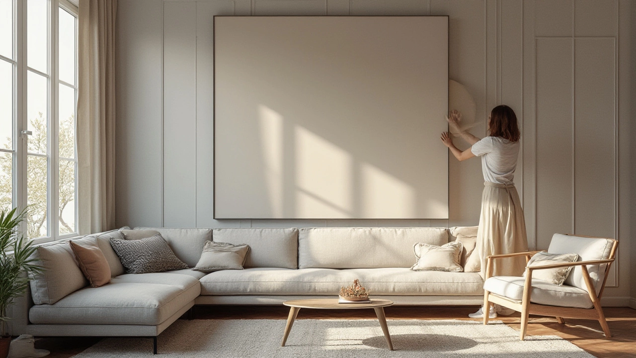
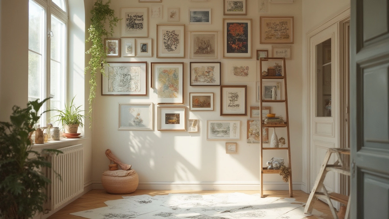
Picture this: you buy that amazing print you saw online, frame it, and hang it up—stepping back, you realize it looks like a postage stamp floating in the middle of a blank wall. Classic rookie mistake! Proportion is the foundation for wall decor. For a piece hung above a sofa or bed, aim for artwork that’s about two-thirds the width of the furniture below it. If you’re pairing multiple pieces, treat the arrangement’s combined width that way. Art that’s too small looks lonely, while something massive can feel overwhelming unless that’s your intent.
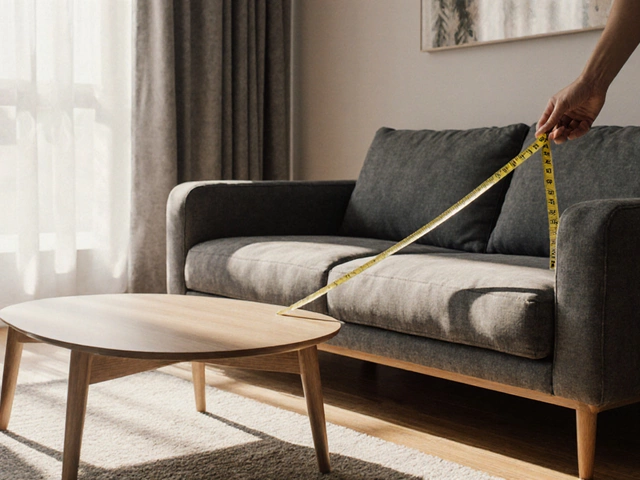
There’s a golden rule about eye level: aim for the center of your art to be around 57–60 inches from the floor. That’s not some number plucked out of thin air—museums use this as their anchor. This puts pieces right where your eyes naturally land. Don’t anchor to the top of the sofa or a random nail already on the wall. Use a tape measure and a bit of painter’s tape if you want to visualize before hammering away.
Spacing matters too. When hanging a gallery wall—think a collection of assorted frames and prints—keep about 2–5 inches between each item. It’s enough for each piece to breathe, but close enough to feel cohesive. Here’s a tip most people overlook: lay all your art on the floor to choose the arrangement before committing to wall holes. Just snap a pic once you’re happy, so you have a guide when you’re on the ladder. Trust me, you’ll save yourself a day’s worth of patching and painting.
For a quick reference, take a look at how professionals break it down:
| Element | Standard Measurement | Why It Works |
|---|---|---|
| Art Height | 57-60" center from floor | Aligns with average sightline, like galleries |
| Art Width over Furniture | ~2/3 furniture width | Keeps visual harmony, avoids crowding |
| Space Between Frames | 2-5" apart | Makes arrangement feel unified, not cluttered |
| Gallery Height Range | Starts 6-12" above furniture | Connects art with furniture, not floating off |
Lighting is the unsung hero here. If your wall catches a flood of sunlight for half the day, avoid delicate photography or textiles that’ll fade. Use picture lights or adjustable sconces for dim corners—art gets a chance to pop, even when the natural light dips. And when it comes to frames? Mix up the textures—wood, metal, or thick mats—to make arrangements interesting. Matchy-matchy frames have their place, but they can also look like a catalog if you’re not careful.
Style, Story, and Personality: Express Yourself Without the Chaos
Sticking to rules doesn’t mean your walls become bland. This is where you weave in your own story. Maybe you’re into black and white photography but can’t resist bold, oversized typography. Or perhaps your idea of “art” is your kid’s painted spaghetti disaster next to a sleek museum poster. There are no decor police, but curating is key.
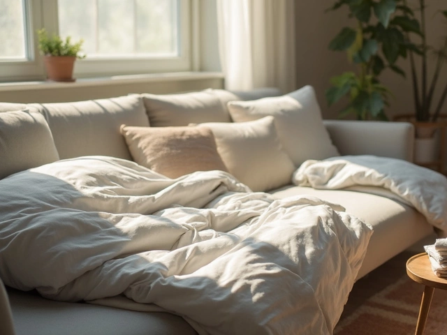
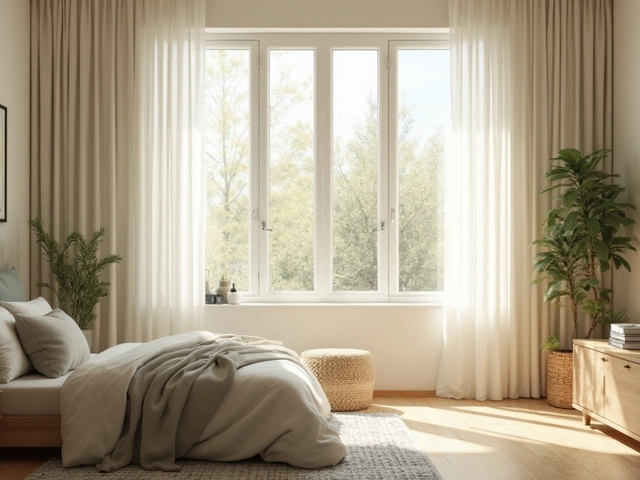
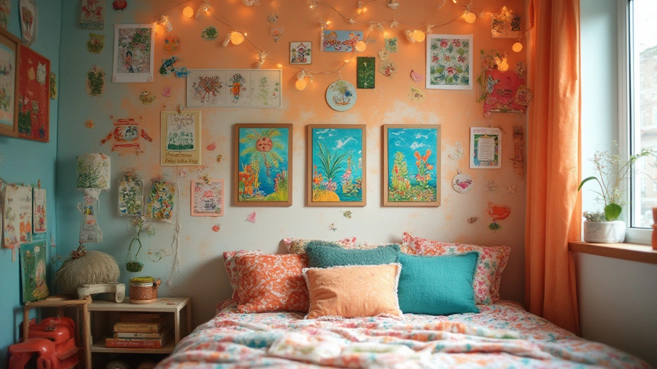
Before you start hammering away or swiping your card, think about what you want each room to feel like. Let’s be real: a hallway asks for something different than a bedroom. Living rooms can handle drama—big canvases or even textured pieces like woven wall hangings. Dining rooms often look killer with symmetrical arrangements—a pair or grid of prints. Bedrooms feel most calming with soft, cohesive colors or serene landscapes.
Gallery walls make a huge impact but are notorious for turning visual excitement into chaos if you’re not careful. Cheat code: stick to a color family or unifying theme, like coastal scenes or graphic abstracts. Vary frame sizes, but keep something consistent—like all black frames, or all white borders. And don’t be afraid to take it beyond just art prints. Try mirrors (great for light and making spaces feel bigger), shelves with plants, or even sculptural pieces like hanging ceramics.
The most interesting rooms are unapologetically personal. Did you know about 65% of people say their favorite thing they own is something with a story? That old jazz poster from your first apartment, concert tickets, even textile fragments—group these together for a mini-archive of your life. Not every wall needs to make a statement. Sometimes less really is more, especially in small rooms. About 41% of interior designers say “negative space”—areas left intentionally blank—matters just as much as what’s displayed. So leave some breathing room.
Here’s another pro tip: mix up what you hang with where you hang it. Not everything must be dead center on a big wall. Tuck something bold on a narrow column, or lean a few large canvases on a console for a chill, modern vibe. If you travel, why not display a rotating collection of prints or objects in frames with easy-to-swap backings? Your walls can grow with your life, not just your Pinterest board.
If you’re after balance, try the “triangle rule.” Picture three main elements (say, a large painting and two smaller prints) forming a loose triangle to guide the eye. It’s a trick loads of designers use so a collection never feels like it’s sliding off in one direction.
Remember: the best rooms play with a little tension. Mix old and new, personal and polished. The trick is to make it look like everything landed there by accident—just perfectly on purpose.
Details and Dos & Don’ts: Hanging, Materials, and Common Mistakes
Let’s cut to the chase: beautiful walls come down to execution. You don’t need an army of tools or a weekend workshop. Start simple; get a tape measure, a level (a basic app on your phone works), and the right hardware for whatever you’re hanging. Drywall hooks work wonders for most frames, but if you’re going big (like a mirror or vintage tapestry), use anchors. Don’t trust thumbtacks unless you want everything to crash during your next dance party.
Want your wall decor to actually stay up? Always check the weight limits on your hangers and wall type. Drywall, plaster, brick—they each need their own approach. For heavier pieces, a little research pays off. Command strips are fine for light, kid’s art, but don’t challenge them with a 15-pound sculpture.
If you ever worry about lining stuff up, painter’s tape is a game changer. Lay it out exactly where your art should go, step back, and adjust before you start putting holes in walls. And a level saves more friendships than people realize—crooked art bugs everyone, even if they won’t admit it.
Frame choice affects not just aesthetics but also the longevity of your art. UV glass or acrylic can protect delicate pieces from sun damage. If you’re hanging original art or something valuable, consider professional framing—about 30% of damage comes from using the wrong materials or matting, according to the Fine Art Trade Guild. Don’t hang art in damp rooms or right above radiators unless you’re prepared for warping and fading.
It’s tempting to fill every inch, but that’s a trap. Designers agree a “gallery effect” works best within limits—up to a seven-piece grid for most residential spaces. Any more and the impact starts to blend into the background.
Here’s a quick hit list of do’s and don’ts:
- Do: Match your hang height to average eye level (57–60-inches center from the ground).
- Do: Group art by themes or color for cohesion; mix shapes and frame materials for fun.
- Do: Use adequate hardware for the weight and wall type. Level everything.
- Don’t: Hang small art alone on a large wall—it’ll look lost.
- Don’t: Forget negative space. Not every inch needs filling.
- Don’t: Hang above radiators or in wet bathrooms unless the art is resistant.
- Don’t: Rush—a little planning spares new holes in your wall (and your sanity).
There’s no wall too tricky to tackle. Whether it’s awkward corners, sloped ceilings, or wild paint colors, there’s a hack for every scenario. At the heart of great wall decor? Thoughtfulness—a blend of planning, personality, and the guts to switch it up until it feels right. So look at your space, grab your favorite piece, and build out a display that says something about you. That’s the best rule of all.