Happiest Colors for Your Home – Bright Ideas That Lift the Mood
Ever walked into a room and felt an instant smile? That’s the power of happy colors. A splash of sunny yellow, a pop of coral, or a cool turquoise can turn a dull space into a place you actually want to be. The trick is knowing which shades work where and how much to use.
Pick the Right Happy Hue
Not every bright shade fits every room. Here are the top five that most people agree feel uplifting:
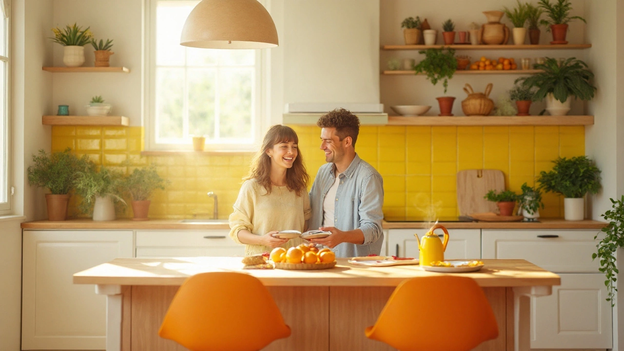
- Sunny Yellow – Great for kitchens and breakfast nooks. It mimics morning light and can make a small space feel larger.
- Coral or Peach – Adds warmth without being overwhelming. Works well in living rooms and entryways.
- Turquoise or Aqua – Gives a fresh, breezy vibe. Perfect for bathrooms or a calming bedroom accent.
- Mint Green – Soft enough for bedrooms but still energising. Pairs nicely with white or light wood.
- Soft Pink – Modern pinks are less sugary and more sophisticated. Use on a feature wall or in textiles.
When you choose, think about the room’s purpose. A kitchen needs energy, so yellow or coral can help. A bedroom wants calm, so mint or soft pink works better.
How to Use Happy Colors Without Overdoing It
Too much bright paint can feel like a headache. Keep balance by following three simple rules:
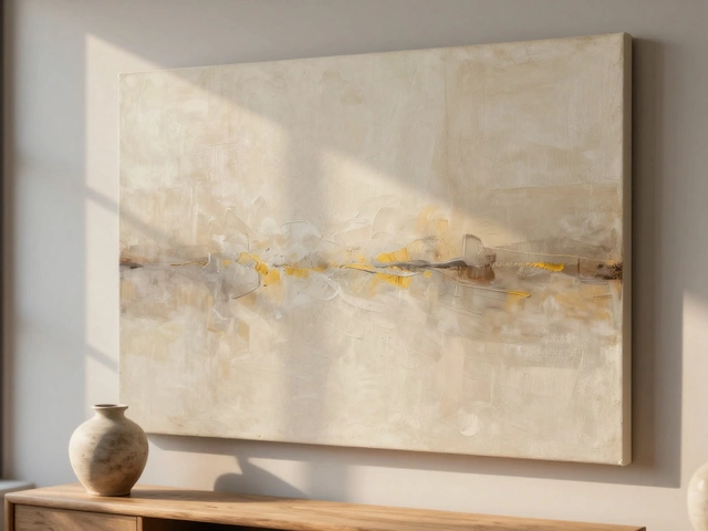
- Start Small – If you’re unsure, add color through cushions, throws, or artwork first. A turquoise pillow on a neutral sofa adds a pop without a full commitment.
- Pair with Neutrals – White, gray or light wood tones let the happy color breathe. A coral accent wall looks stunning when the rest of the room stays light.
- Mind the Light – Bright colors reflect light, making a room feel larger. In a dark space, use a lighter shade of the happy color or keep the hue on the walls rather than the ceiling.
One practical tip: paint the upper half of a wall in a happy shade and the lower half in a soft neutral. This “two‑tone” look adds interest without a full‑room makeover.
Another easy win is to use happy colors on built‑in furniture. A turquoise bookshelf or a mint kitchen island draws the eye and creates a focal point. It’s the same idea behind the "Most Durable Sofas" article – choose a piece that stands out but still fits the overall style.
If you love patterns, pick a simple stripe or geometric print that mixes a happy hue with a neutral base. This keeps the energy up while staying classy.
Finally, test paint swatches at different times of day. A color that looks perfect in the morning might feel harsh by evening. Small patches on the wall let you see the real effect before committing.
Happy colors aren’t just a trend; they’re a mood‑boosting tool. Whether you go bold with a full‑room yellow or keep it subtle with coral cushions, the goal is to make your home feel more alive. Play, experiment, and enjoy the brighter side of interior design.


