Gray dominated wall art for over a decade. It was the safe pick, the quiet backdrop, the color everyone defaulted to when they didn’t know what else to choose. But somewhere around 2024, something shifted. People started getting tired of the cool, flat, lifeless feel gray brought to their spaces. It wasn’t that gray was bad-it had its moment. But now, a warmer, softer, more human tone is stepping in. And that color? It’s beige.
Beige Isn’t What You Think It Is
When you hear "beige," you probably picture old-school carpet from the ‘90s or a dusty curtain in a dentist’s waiting room. But today’s beige is nothing like that. Modern beige is rich, layered, and full of depth. It’s not one shade-it’s a family of tones. Think warm taupe, creamy oat, stone sand, and soft clay. These aren’t flat colors. They have undertones of pink, yellow, or even a whisper of green. They change with the light. They feel alive.
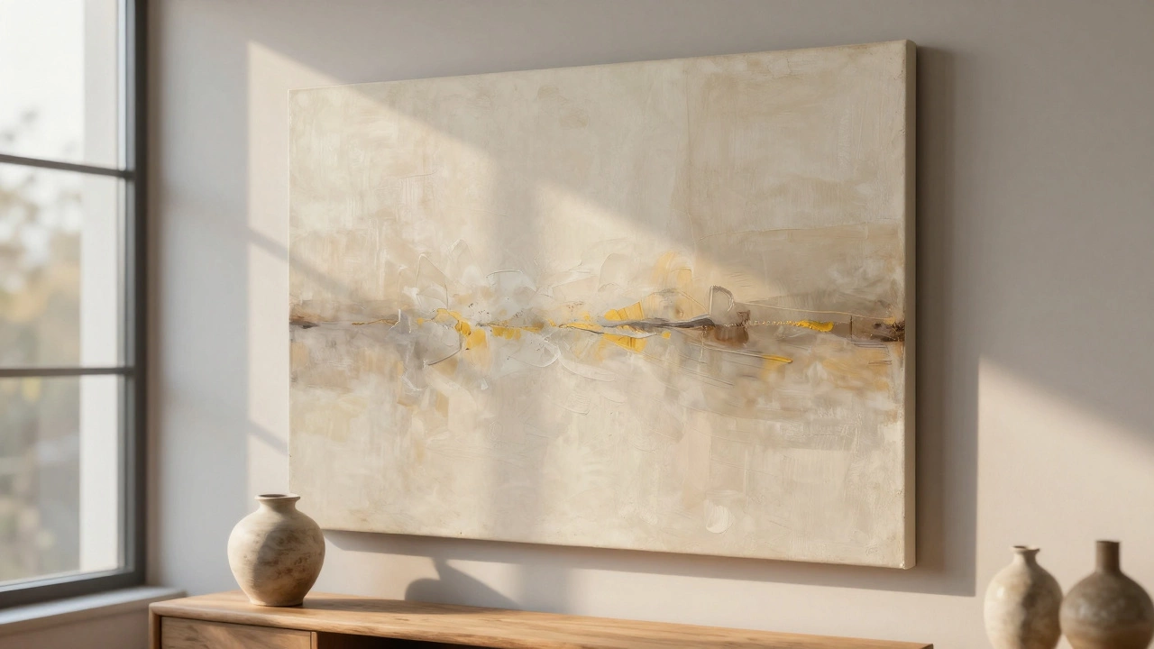
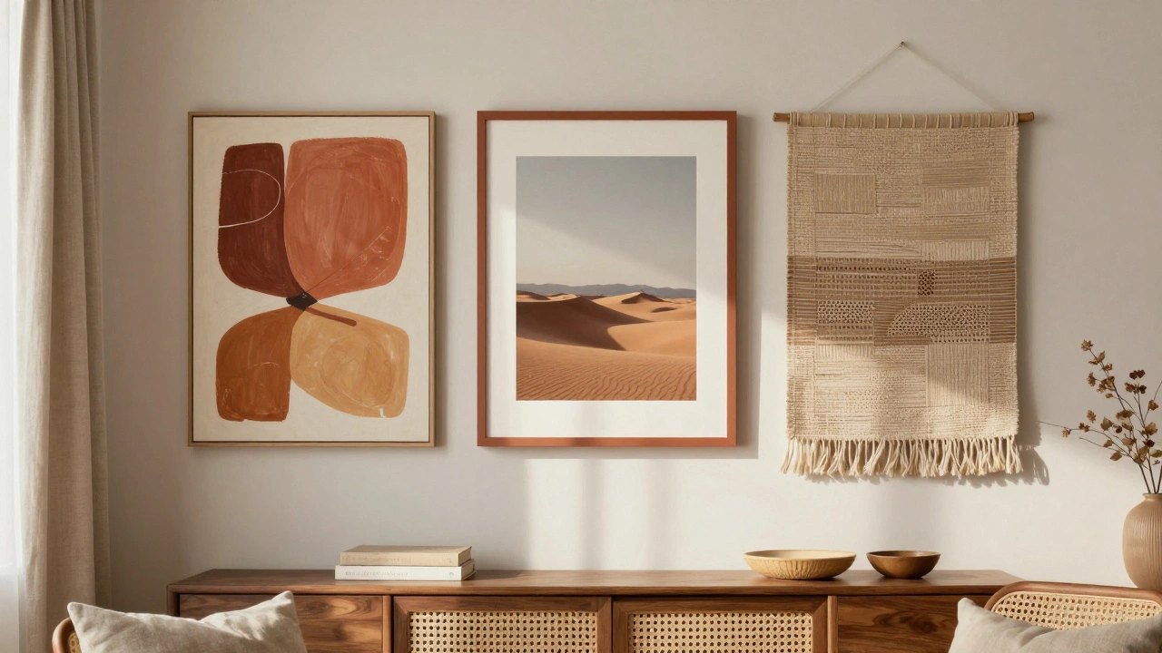
Wall art in these tones doesn’t scream. It breathes. It doesn’t compete with your furniture. It holds space quietly, like a good listener. A large abstract canvas in warm oat, for example, adds texture without overwhelming. A framed botanical print on a clay-toned background feels grounded, not cold. This isn’t about removing color-it’s about bringing warmth back into the room.
Why Gray Lost Its Grip
Gray worked because it was neutral. But neutrality doesn’t always mean comfort. Gray walls and gray-toned art created spaces that felt sterile, even in luxury homes. People started noticing how gray made their living rooms feel like hotel lobbies. It didn’t invite you in. It just sat there.
After years of pandemic living, homes became sanctuaries, not showrooms. We wanted spaces that felt like a hug-not a spreadsheet. Warm neutrals do that. They’re soothing without being boring. They pair effortlessly with wood tones, linen fabrics, rattan, and ceramic pots. They make sunlight look golden, not harsh.
A 2025 survey by the Interior Design Institute found that 68% of homeowners who repainted or replaced wall art in the past year chose warm beige tones over cool grays. The biggest reason? "It makes the room feel calmer." Not prettier. Not trendier. Calmer.
How Beige Works With Wall Art
Beige isn’t just a background-it’s a partner. When you choose wall art with beige tones, you’re not just picking a color. You’re picking a mood. Here’s how it plays out:
- Textured canvases in warm taupe add depth without pattern. Perfect for minimalist spaces.
- Photography prints with soft desert landscapes or muted sunsets look more natural on a beige-toned frame.
- Hand-painted abstracts with earthy ochre and terracotta strokes feel organic, not staged.
- Woven tapestries in oat and sand tones bring in texture and warmth, especially in bedrooms.
Beige art also plays well with other materials. A dark walnut shelf below a beige canvas? Magic. A white ceramic vase on a side table next to a clay-toned print? Effortless. It doesn’t need to match perfectly-it just needs to feel connected.
What About Other Neutrals?
You might hear people talking about "greige"-a mix of gray and beige. Or "greige" with a hint of green. But those are transitional. They’re the middle ground. The real shift is moving away from cool undertones entirely. Beige doesn’t flirt with gray. It leaves it behind.
Some designers still use soft gray in accent walls or modern studios. But even there, it’s often paired with a warm beige rug, pillow, or art piece to balance it. The trend isn’t about removing gray completely-it’s about making sure it doesn’t lead.
White is still popular, sure. But pure white walls and white-toned art can feel clinical. Beige has a subtle glow. It’s the color of morning light on a stone path. It’s the color of a well-loved book cover. It doesn’t glare. It welcomes.
Where to Start
If you’re ready to replace your gray wall art, here’s how to begin:
- Look at your existing furniture. What wood tones do you have? Warm walnut, oak, or teak? Beige will hug those tones better than gray.
- Hold up swatches of beige fabric or paper against your wall at different times of day. Does it look too yellow? Too pink? Too flat? The right beige should feel neutral, not colored.
- Start small. Swap one piece of art. Try a 16x20 inch canvas in warm oat. See how it changes the room’s energy.
- Don’t overthink texture. A slightly rough, hand-made feel works better than a glossy, mass-produced print.
- Let light do the work. Beige shines in natural light. Avoid placing it in dark corners.
The Bigger Shift
This isn’t just about wall art. It’s about how we’re rethinking our homes. We’re done with cold perfection. We want spaces that feel lived-in, real, and quietly comforting. Beige doesn’t try to be bold. It doesn’t need to be the center of attention. It just needs to be there-soft, steady, and warm.
Gray gave us structure. Beige gives us peace. And right now, peace is the most valuable thing a wall can offer.
Is beige too trendy to be a long-term choice?
Beige isn’t a trend-it’s a return. Warm neutrals have been used in homes for centuries, from Mediterranean villas to Japanese tatami rooms. What’s new is the modern palette: deeper, richer, and less pastel. This isn’t a flash in the pan. It’s a reset. People are choosing beige because it works with timeless materials like wood, stone, and linen-not because it’s Instagram-famous.
Can I use beige wall art in a small room?
Yes-beige actually helps small rooms feel bigger. Unlike dark colors that shrink space, or white that can feel flat, warm beige adds dimension without heaviness. A single large beige canvas on one wall creates a visual anchor. It draws the eye gently, making the room feel intentional, not cramped. Pair it with light wood floors and soft lighting for maximum openness.
What if my walls are still gray?
You don’t need to repaint. Beige wall art can still work beautifully against gray walls. The key is contrast. Choose a beige with a clear warm undertone-like a soft terracotta or golden oat-so it stands out. The gray becomes a neutral backdrop, and the beige art becomes the focal point. It’s a subtle upgrade that doesn’t require a full renovation.
Are there any colors that clash with beige wall art?
Beige is one of the most forgiving colors. It pairs well with almost everything. The only thing to avoid is cool, icy tones right next to it-like icy blue, steel silver, or stark white. These can make the beige look dirty or outdated. Instead, lean into warm metals (brass, copper), natural wood, and soft textiles like wool or cotton. These elevate beige instead of fighting it.
Where can I find authentic beige wall art?
Look for artists who use natural pigments or hand-mixed paints. Brands like MCM Studio, The Earth Collection, and local New Zealand ceramicists often create pieces in warm earth tones. Avoid mass retailers that label anything "beige"-many are just off-white. Read product descriptions carefully. The best pieces mention undertones like "terracotta," "sandstone," or "warm taupe." If it says "neutral," ask for a photo in natural light.