Ask ten people which colors feel happiest and most will point at the warm end of the spectrum. Science agrees. If you want the quickest mood lift from paint, textiles, or brand accents, go warm, bright, and saturated-specifically yellow and orange. That’s the core answer. The nuance is where, how intense, and how much.
Happy colors is a concept in color psychology describing hues and tones that most reliably produce positive affect (joy, optimism, playfulness) across contexts when brightness (luminance) and color purity (saturation) are high. Color psychology is the study of how color attributes (hue, saturation, brightness) influence emotions and behavior; key findings show brighter and more saturated colors drive more positive valence. Happiness (emotion) is a positive affective state linked to reward systems and approach motivation; in color research, it correlates with high valence and moderate-to-high arousal.
TL;DR
- The two happiest colors: yellow and orange (bright + saturated).
- Why: high brightness and saturation boost positive feelings (Valdez & Mehrabian, 1994; Palmer & Schloss, 2010).
- Use: walls in light rooms, accents in darker rooms, 60-30-10 balance.
- Runner-up: pink for playful warmth; blue/green are calm, not “happiest.”
- Mind light direction, cultural cues, and accessibility (contrast).
The two happiest colors (and why these two win)
Yellow is a warm spectral color with wavelength ~570-590 nm; typical cheerful design shades sit around HEX #FFD300 to #FFEB3B, often perceived as the brightest hue in equal-luminance sets and strongly associated with joy and optimism. Orange is a warm spectral color with wavelength ~590-620 nm; energetic oranges in the HEX #FF7A00 to #FF9E00 range feel friendly and social, balancing high arousal with positive valence.
Across controlled studies, brighter and more saturated colors are rated happier than muted or dark ones, regardless of hue. Valdez & Mehrabian (1994) showed pleasantness climbs with brightness and saturation. Palmer & Schloss (2010) found our preferences track ecological valence-the colors of things we like (sunlight, ripe fruit) get a halo. Yellow and orange check all boxes: they’re bright, associated with sunshine and fruit, and sit in the warm quadrant that raises arousal just enough to feel lively, not anxious.
Two quick heuristics that map to this research:
- Choose warm hues (yellow/orange) with saturation ≥ 60% for “happy,”; drop to 30-50% for subtle warmth.
- Keep perceived brightness high: aim for lightness (L in HSL) around 60-80% for walls, 40-60% for accents.
What your brain is doing when it sees happy colors
HSL color model is a color representation with three attributes: Hue (0-360°), Saturation (0-100%), and Lightness (0-100%); it maps closely to how we talk about color in design. Saturation (color) is the intensity or purity of a color; higher saturation reads as vivid and is linked to higher arousal and stronger affect.
When a surface reflects lots of light (high L) and the hue is pure (high S), our visual system flags it as salient-worth attention. Warm hues also nudge arousal upward. Put together, you get an approach signal: this is good, this is lively. Neuroscience papers tie positive affect to dopamine pathways and approach motivation; while color isn’t a drug, the pattern is consistent: warm, bright, saturated = more positive ratings. No surprise that Pantone picks optimistic warm tones often-“Illuminating” (a yellow) in 2021, “Peach Fuzz” (warm pink-orange) in 2024-to mirror collective mood.
Where pink, blue, and green fit
Pink is a tint of red (red + white), commonly associated with playfulness and comfort; happy-feeling pinks cluster around HEX #FF6FB1 to #FFB3C7 at medium-high lightness. Pink is the close runner-up for happiness cues if you prefer less citrus and more candy-floss energy. It’s social and soft. Still, it’s technically a red tint, so it can carry sweetness that not everyone wants on large surfaces.
Blue is a cool spectral color (~450-495 nm) typically linked to calm, clarity, and trust; happy ratings climb when blue is bright and moderately saturated, but it’s more soothing than “joyful.” Green is a cool color (~495-570 nm) associated with nature and balance; bright yellow-greens can feel fresh and cheerful, but many greens skew restful over jubilant. Blue and green consistently score as pleasant but lower on arousal-great for bedrooms or spa-like baths, less for party kitchens. In large cross-cultural studies (e.g., Jonauskaite et al., 2019/2020, Frontiers in Psychology), yellow linked most to joy, while blue linked to calm.
Quick comparison: which colors feel happiest in practice?
| Color | Typical happy HEX | HSL (approx.) | Valence/Arousal | Best Uses | Caveats |
|---|---|---|---|---|---|
| Yellow | #FFEB3B / #FFD300 | H: 55-60°, S: 90%, L: 60-75% | Highest valence; high arousal | North-facing living rooms, kitchens, entry halls | Too much can glare; needs soft textures |
| Orange | #FF8C00 / #FF9E00 | H: 30-40°, S: 90%, L: 55-65% | High valence; high-moderate arousal | Dining nooks, social spaces, accents on neutral walls | Can feel hot in small, dark rooms |
| Pink | #FF6FB1 / #FFB3C7 | H: 340-350°, S: 70-80%, L: 65-80% | High valence; moderate arousal | Bedrooms, nurseries, playful accents | Sweetness isn’t universal |
| Blue | #4FC3F7 / #64B5F6 | H: 200-210°, S: 70-85%, L: 55-70% | High valence; lower arousal | Bedrooms, offices (focus), bathrooms | Can feel cool in dim spaces |
| Green | #7ED957 / #A5D6A7 | H: 110-130°, S: 50-75%, L: 55-70% | Moderate-high valence; low-moderate arousal | Living rooms, kitchens (freshness) | Muddy greens read dull if L is too low |
How to use yellow and orange at home without overdoing it
Start simple: the 60-30-10 rule. Make 60% a calm neutral (soft white, warm beige, muted grey), 30% a supporting tone (wood, stone, or a muted color), and 10% your happy hit (yellow/orange). That 10%-pillows, art, a side chair, a splashback-does the mood work without shouting.
Light direction matters. In the Southern Hemisphere, north-facing rooms get the most direct sun and can handle bolder yellows and mid oranges on larger surfaces. South-facing rooms skew cool; use creamier yellows (higher lightness, lower saturation) and keep orange to accents so it doesn’t feel heavy. East light is crisp in the morning (great for cheerful breakfasts); west light is warm and can boost orange dramatically at sunset.
Finish affects brightness. Gloss raises perceived brightness and color intensity; it’s lively on trim but too much on walls can glare. Eggshell or satin keeps lightness high but kinder on the eyes. In very bright rooms, choose slightly less saturated paint so the sun doesn’t supercharge it.
Three real-world palettes that just work:
- Sunny Scandinavian: Walls #FDF7E3 (warm off-white), sofa in oatmeal beige, accents in #FFEB3B (lemon yellow) and ash wood. Feels bright without being loud.
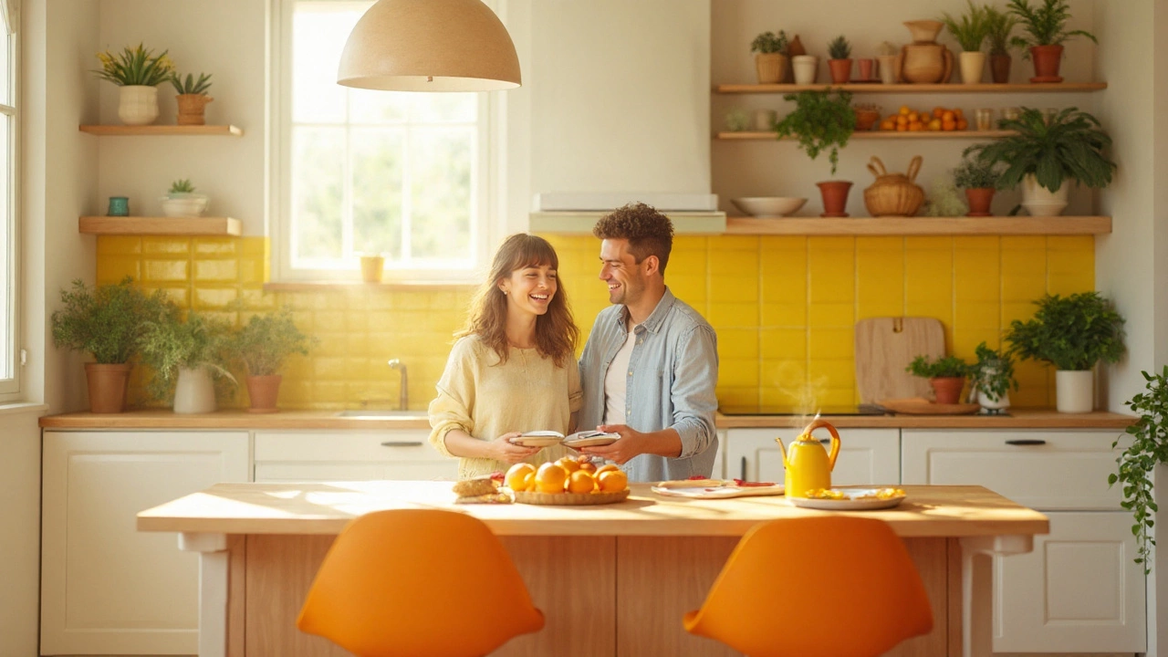
- Modern Citrus: Walls #FAFAFA (clean white), cabinetry #2F2F2F (charcoal), stools in #FF8C00 (orange), tea towels #00BCD4 (aqua) for contrast. Kitchen looks energetic, not chaotic.
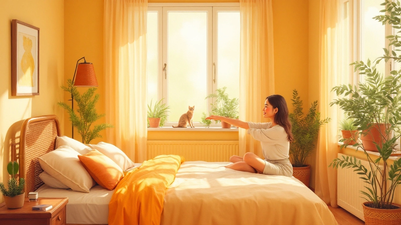
- Soft Glow Bedroom: Walls #FFF1CC (buttery cream), linen in stone, throw in #FFB74D (apricot), lamp shades natural flax. Warmth without insomnia.
Textiles and textures steady the ship. Pair bright yellow/orange with matte, tactile surfaces-bouclé, linen, raw timber, rattan-so the eye has places to rest. If a pure #FFEB3B cushion feels sharp, shift to a mellow mustard (#D4A017) or a goldenrod (#FFC107) and keep lightness high.
How much is too much? Use these guardrails
- Wall coverage: in bright rooms, 1 wall in saturated yellow/orange is plenty; do adjacent walls in a lighter tint or neutral.
- Accents per view: 2-3 warm accents visible at once is lively; 6+ starts to look like signage.
- Contrast for readability: shoot for strong light-dark separation (think 4.5:1 contrast if you’re designing graphics or signage).
- Flooring anchor: a medium-dark floor (walnut, smoked oak, or textured sisal) grounds high-luminance colors.
Cultural and context cues you shouldn’t ignore
Yellow reads joyful in many places but can also signal caution (signage, taxis). In parts of Asia, yellow and orange link to spirituality and royalty; in Latin America, yellow marigolds show up in remembrance rituals and still feel bright. Context sets meaning. If you’re designing a kid’s playroom, orange is playful. In a clinic, a lot of orange can feel too hyped-choose soft apricot accents instead.
Also factor in color vision differences. Around 8% of men and 0.5% of women of Northern European descent have red-green deficiencies. For them, orange may look brownish at lower saturation. Solution: push lightness up and pair orange next to a cool hue (teal) to keep separation clear.
Why yellow and orange beat the rest for “happiest”
Here’s the clean logic chain: High lightness + High saturation → Higher positive valence (Valdez & Mehrabian, 1994). Warm hues → Higher arousal (Ou et al., 2004). Ecological valence → We like colors of things we like (Palmer & Schloss, 2010). Combine the three, and yellow/orange land at the sweet spot for happiness ratings. Blue and green stay pleasant, just calmer.
Branding and digital: translate happy color to screens
On screens, the same rules apply but watch luminance. Pure yellow (#FFFF00) on white has low contrast; it glows but isn’t readable. Use darker outlines (#7B7B00) or place yellow on charcoal for punch. For buttons, orange (#FF8C00) often converts better than yellow because it maintains contrast on white while signaling warmth. Keep saturation high (70-90%) and lightness around 50-60% for UI elements so they pop without eye strain.
Related concepts and where to go next
Happy colors sit inside a bigger cluster: color temperature (warm vs cool), chroma, luminance, and context effects like the Helmholtz-Kohlrausch effect (colorfulness boosting brightness perception). If you want to keep exploring, look at palette building, biophilic design (for calm), and circadian lighting (for energy timing). This topic also connects to materiality (gloss vs matte), spatial proportion (feature walls vs envelopes), and trend forecasting (Pantone’s annual picks).
Fast checklist
- Pick 1: Yellow (#FFEB3B) or Orange (#FF8C00) as your main happy accent.
- Balance: Use 60-30-10; keep happy color around 10-20% of the scene.
- Light: Go creamier in cool rooms, bolder in sunny rooms.
- Texture: Soften with matte, natural materials.
- Test: Paint a 1 m² sample board; look at it morning, noon, evening.
Final note: if anyone asks, the two happiest colors are yellow and orange-bright, saturated, and used with a bit of restraint.
Frequently Asked Questions
Are yellow and orange always the happiest colors?
In most research and real spaces, yes. Bright, saturated yellows and oranges score highest for “happy” because they’re warm, luminous, and linked to positive things like sunshine and ripe fruit. That said, personal history and culture can shift responses. If orange reminds you of caution cones, you may prefer a sunny cream or fresh yellow-green for the same mood.
Which shades of yellow and orange should I actually buy?
For yellow, look near HEX #FFEB3B (lemon) or #FFC107 (goldenrod) at medium-high lightness (L 65-75%). For orange, try #FF8C00 (vivid) or #FFB74D (apricot) for softer rooms. If your space is dim and cool, pick creamier yellows (more white mixed in). If it’s sun-baked, step down saturation a touch so it doesn’t scream at midday.
Is pink a happy color too?
Yes-especially warm, bright pinks. They often feel playful and affectionate. Many people rate pink as happy, but on average yellow and orange edge it out for sheer “joy” ratings. If you find yellow brash, a coral or salmon can deliver similar warmth with less intensity.
Why don’t blue and green rank as happiest if people love them?
People do love blue and green, and they rate as pleasant. They just tend to be calmer (lower arousal). Happiness in lab ratings leans toward colors that are both positive and lively. Bright sky blue can feel cheerful on a sunny day, but all else equal, a lemon yellow still rates “happier.”
How much yellow/orange should I use in a small room?
Keep saturated yellow/orange to 10-20% of the visual field. Try one accent wall or a cluster of accessories (art, cushions, lamp shades) instead of wrapping every surface. In very small or low-light rooms, a buttery cream with orange or brass accents feels happy without closing the space in.
What if I want a happy office without distractions?
Use neutrals for the big surfaces (soft white, warm grey) and drop in tight bursts of orange-desk accessories, a poster, chair upholstery. Keep the accents below eye line or off screen glare paths. A bright desk lamp with a warm shade can lift mood without cluttering your field of focus.
Do these rules change under different lighting (LED vs daylight)?
Yes. Cool LEDs (5000-6500K) make yellows look sharper and oranges more red; warm LEDs (2700-3000K) boost the cozy side of orange and soften yellows. Always sample under your actual lighting. If your room uses cool LEDs, select a slightly warmer yellow to compensate.
What studies back this up if I need to convince someone?
Key ones: Valdez & Mehrabian (1994) on brightness/saturation driving pleasantness; Palmer & Schloss (2010) on ecological valence (we prefer colors of liked objects); Ou et al. (2004) on warm hues raising arousal; Jonauskaite et al. (2019/2020) cross-cultural work linking yellow to joy and blue to calm. These are staple references in color research and design education.
Can I make a dark hallway feel happier without repainting?
Yes: swap in warm LED bulbs (2700-3000K), hang art with yellow-orange highlights, add a runner with golden threads, and place a small mirror to bounce what light you have. Even a brass-framed mirror adds a happy glint without a full paint job.
Next steps
Pick one room. Tape up two A3 sample boards: one lemon yellow (#FFEB3B) and one apricot (#FFB74D). Watch them for three days-morning, midday, evening. If you smile every time you walk past one, that’s your winner. Then, apply the 60-30-10 rule, add soft textures, and you’re done.
If yellow/orange still feel like too much, try a happy compromise: a creamy yellow-white for walls and a single orange object with presence-a lounge chair, a kettle, a framed print. Tiny move, big lift.
Happy colors work best when tailored to light, scale, and texture-bright, warm, and a touch restrained.

