Luxury Furniture Colour Simulator
Select a colour and texture combination to see how it impacts the perceived "expensive" factor of your furniture piece. Based on principles of depth, saturation, and material quality.
Customize Your Piece
Visual Preview
Cream / VelvetYou walk into a hotel lobby or a friend’s renovated home and immediately feel that sense of calm, curated sophistication. You run your hand along the armrest of a sofa and it feels solid, substantial. You wonder: is it the fabric? The craftsmanship? Or is it actually the colour? Here is the truth: colour is one of the fastest ways to signal value in a room. It costs nothing extra to paint a piece of furniture in the right shade, yet it can transform a budget-friendly item into something that looks like it came from a designer showroom.
But not all colours are created equal when it comes to perceived luxury. Some shades read as "cheap" or "basic," while others whisper "expensive." This isn’t just about personal taste; there are psychological and design principles at play. If you want your living room, bedroom, or office to feel upscale without breaking the bank, understanding which hues convey quality is essential. Let’s break down exactly what makes certain colours look premium and how you can use them effectively.
The Psychology Behind "Expensive" Colours
Why do we associate certain colours with wealth? It largely comes down to history and visibility. Historically, vibrant pigments like deep blues and rich reds were expensive to produce. They required rare minerals or complex processes. Because only the wealthy could afford these bold statements, our brains still link saturation and depth with cost. However, modern luxury has shifted slightly. Today, "expensive" often means understated, complex, and intentional.
A flat, primary red might look toy-like. But a deep, muted burgundy or a sophisticated oxblood reads as classic and costly. Similarly, stark white can sometimes feel clinical or cheap if the lighting is harsh. But a creamy, off-white with warm undertones feels inviting and high-end. The key takeaway? Luxury colours rarely scream. They murmur. They have depth, complexity, and usually exist in the mid-to-dark range or as nuanced neutrals.
Neutrals That Read as High-End
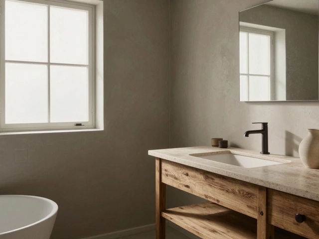
When people think of luxury, they often picture beige or grey. But generic beige can look dated, and standard grey can feel cold and industrial. To make neutrals look expensive, you need to look for warmth and depth.
Warm Whites and Creams: Think of the walls in a boutique hotel. They aren’t bright white; they’re soft, milky, and warm. Applying this to furniture-like a linen-upholstered sofa in a cream tone-creates an airy, expensive feel. It suggests cleanliness and care. Avoid pure, blinding white on large upholstered pieces unless you want a very modern, minimalist look, which can be risky if the fabric texture isn't perfect.
Taupe and Greige: These are the heavy lifters of luxury interiors. Taupe (a mix of brown and grey) and greige (grey-beige) offer more visual interest than plain grey. They pair beautifully with metals like brass or gold, instantly elevating the vibe. A taupe velvet chair looks far more custom-made than a standard grey one because the colour itself has complexity.
Charcoal and Slate: Darker neutrals add weight and seriousness to a space. A charcoal sectional doesn’t just hide stains; it anchors the room. It signals durability and strength. When you choose a dark neutral, ensure the material has some sheen or texture. Matte black can look plastic-y, but matte charcoal wool or textured leather looks incredibly pricey.
The Power of Deep Jewel Tones
If you want to make a statement, go deep. Jewel tones are historically linked to royalty and wealth. The trick is saturation. You don’t want a neon green or a bright royal blue. You want emerald, sapphire, and ruby, but toned down.
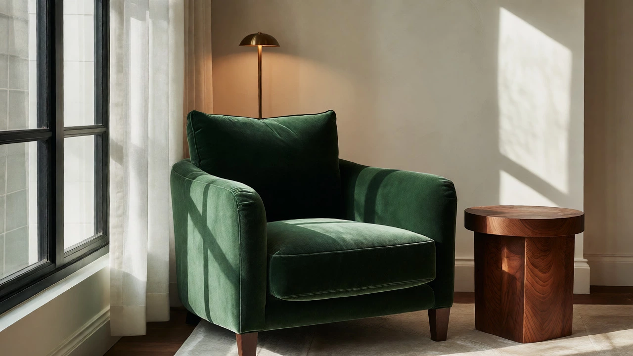
Emerald Green: This is arguably the most versatile luxurious colour right now. An emerald velvet sofa or armchair adds instant drama and richness. It works well against both light and dark walls. Why does it work? Green connects us to nature, but deep green feels ancient and established, like old libraries or grand gardens.
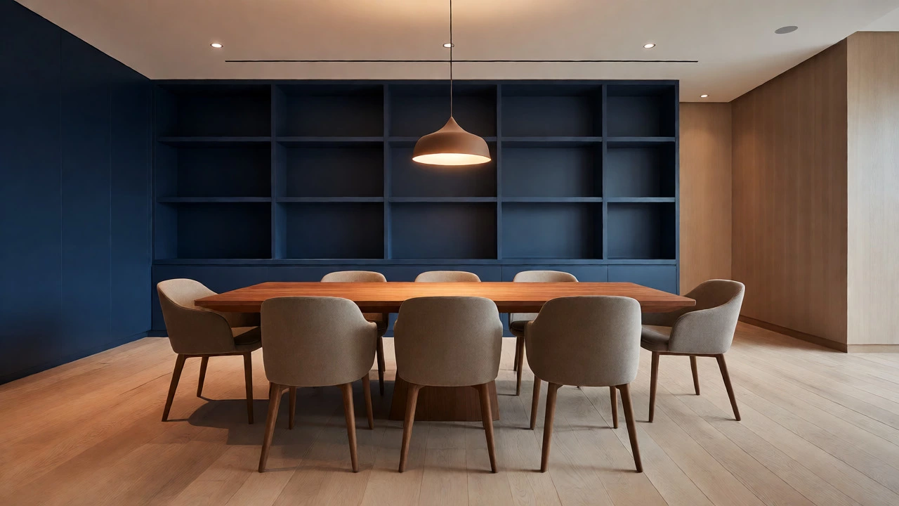
Navy Blue: Navy is the safe bet for those afraid of colour but wanting impact. Unlike black, which can swallow a small room, navy recedes visually, making spaces feel larger while adding sophistication. A navy dining set paired with wooden chairs looks timeless. It’s professional, calming, and undeniably chic.
Burgundy and Plum: These red-purple hues bring warmth and intimacy. They are perfect for bedrooms or cozy reading nooks. A plum velvet ottoman or a burgundy leather recliner feels plush and indulgent. Just be careful with lighting; these colours can look muddy in poor light, so ensure your room has good ambient or natural light.
| Colour Category | Luxury Shade Example | Budget-Looking Equivalent | Why It Works |
|---|---|---|---|
| Neutral White | Cream / Ivory | Pure Bright White | Warmth adds depth; pure white can feel sterile or cheap. |
| Grey | Charcoal / Greige | Flat Light Grey | Darker tones hide wear and suggest solidity. |
| Blue | Navy / Midnight | Sky Blue | Depth implies quality dye and fabric density. |
| Green | Emerald / Forest | Lime / Pastel Mint | Richness evokes tradition and natural materials. |
| Red | Burgundy / Oxblood | Primary Red | Muted tones feel mature and refined. |
Wood Finishes: Stains Matter More Than Wood Type
You don’t need mahogany or walnut to make wood furniture look expensive. You need the right stain. Light oak can look trendy, but it often reads as "IKEA" or "farmhouse basic" if not styled carefully. Darker woods generally command higher perceived value because they show grain detail better and feel heavier.
Espresso and Walnut Stains: These deep browns are classics. They provide contrast against lighter walls and floors. An espresso coffee table looks grounded and serious. However, avoid going too black. Black-stained wood often loses its natural character and can look painted rather than stained. Stick to rich browns where the grain is visible.
Mid-Tone Browns: Cherry or medium walnut tones offer warmth without being too dark. They pair well with traditional and transitional styles. The key here is finish. A high-gloss lacquer can look tacky. A satin or matte oil finish looks organic and high-quality because it highlights the texture of the wood.
How Texture Changes Colour Perception
You can pick the perfect expensive colour, but if the fabric is thin and shiny, it will still look cheap. Texture interacts with light, changing how we perceive colour depth. This is why velvet is so popular in luxury interiors.
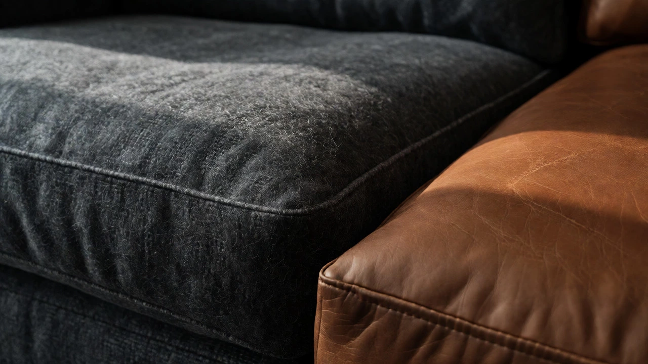
Velvet: Velvet absorbs and reflects light differently depending on the angle. This creates shadows within the colour itself, giving it dimension. A teal velvet sofa looks richer than a teal cotton one because the pile catches the light. If you’re buying faux suede or microfiber, choose darker shades to mimic the depth of velvet.
Leather: Natural leather ages beautifully. Cognac, tan, and black leathers develop a patina that tells a story of use and quality. Synthetic leather (PU) tends to crack and peel, revealing a fabric backing that screams "budget." If you can’t afford real leather, choose a high-quality vinyl with a realistic grain and matte finish, and stick to neutral colours like tan or black to minimize the fake look.
Wool and Linen: These natural fibres have irregular textures that catch light softly. A white linen slipcover looks expensive because it wrinkles naturally-it looks lived-in and relaxed. A stiff, polyester white cover looks crisp but artificial. Choose loose weaves and natural fibres for that effortless luxury.
Common Mistakes That Make Furniture Look Cheap
Even with the right colour, small details can ruin the effect. Here are pitfalls to avoid.
- Ignoring Undertones: A grey sofa might have blue undertones, clashing with your yellow-based walls. Always test swatches in your actual room lighting before committing.
- Too Much Contrast: While contrast is good, a stark white frame on a jet-black cushion can look disjointed. Aim for harmony between the frame and upholstery.
- Glossy Finishes on Large Surfaces: High gloss reflects everything, including scratches and dust. On large pieces like wardrobes or sideboards, satin or matte finishes look more expensive and forgiving.
- Inconsistent Hardware: If your furniture is a deep navy, silver handles might look mismatched. Brass or antique bronze hardware often complements darker, richer colours better, adding a touch of warmth and age.
Practical Tips for Choosing Your Palette
So, how do you apply this to your home? Start by assessing your current space. Do you have cool-toned floors (grey tile, pale wood)? Then lean towards cool neutrals like slate grey or navy. Do you have warm floors (oak, terracotta)? Go for warm creams, taupes, or earthy greens.
Consider the function of the room. Bedrooms benefit from soothing, darker tones that promote rest. Living rooms can handle bolder jewel tones if balanced with neutral accessories. Offices look sharp with deep blues or charcoal, conveying professionalism.
Finally, remember that lighting changes everything. A colour that looks expensive in daylight might look dull under fluorescent bulbs. Buy a sample pot of paint or a fabric swatch. View it at different times of the day. If it holds up in low light, it’s likely a winner.
Investing in furniture is a long-term commitment. By choosing colours that convey depth, warmth, and complexity, you’re not just decorating-you’re curating an atmosphere of quality. You don’t need to spend thousands to achieve this. Sometimes, simply painting a thrifted dresser in a rich, matte charcoal or reupholstering a chair in deep emerald velvet is enough to transform it into a statement piece that guests will assume cost a fortune.
Does black furniture always look expensive?
Not necessarily. While black is classic, it can look cheap if the finish is too glossy or if the material feels lightweight. Matte black wood or high-quality black leather looks expensive. Glossy black plastic or laminate often looks budget-friendly. Depth and texture matter more than the darkness of the colour.
What is the most versatile luxury colour for a sofa?
Taupe or Greige is widely considered the most versatile luxury colour. It bridges the gap between warm and cool tones, pairs with almost any accent colour, and hides stains better than white while feeling softer than black. It provides a neutral backdrop that allows other design elements to shine.
Can bright colours ever look expensive?
Yes, but they must be saturated and deep. Neon or pastel brights often look playful or cheap. Deep jewel tones like emerald green, sapphire blue, or ruby red look expensive because they require high-quality dyes and fabrics to maintain their richness. The key is avoiding brightness in favor of depth.
How does lighting affect the perceived value of furniture colour?
Lighting dramatically alters how colour is perceived. Warm lighting enhances yellows and reds, making creams and taupes feel cozier and more expensive. Cool lighting can make whites look clinical and blues look sharper. Always test your chosen colour in the specific lighting conditions of your room to ensure it retains its intended depth and richness.
Is white furniture hard to keep looking expensive?
Yes, white furniture requires maintenance to look expensive. Dirt and yellowing can make it look neglected. To keep it looking high-end, choose fabrics with tight weaves or performance textiles that resist staining. Regular cleaning and protection are essential. Off-whites and creams are generally more forgiving and maintain their luxurious appearance longer than stark pure whites.