Wallpaper Contrast & Impact Simulator
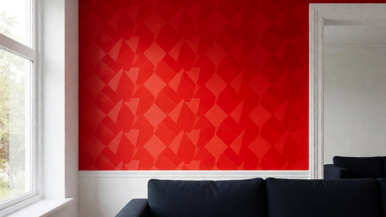
Select a wall color and an accent/furniture color to see how they interact. Adjust lighting to simulate different room conditions. This tool demonstrates the "pop-out effect" and figure-ground relationships discussed in the article.
Visual Preview
You walk into a room and your eyes don't just wander-they lock onto something. Maybe it's the bold red accent wall, or perhaps it's the stark white trim against a dark navy backdrop. But why does one specific hue grab your attention while others fade into the background? It isn't magic; it's biology and physics working together.
If you're choosing wallpaper for your next project, understanding what color attracts the human eye most is crucial. You aren't just picking a pretty pattern; you're directing where people look. The short answer? There is no single "best" color in isolation. Instead, it’s about contrast, wavelength, and context. Let’s break down how to use this knowledge to make your walls pop.
The Science Behind Visual Attention
Your eyes are designed to detect movement and difference. In evolutionary terms, spotting a bright red berry among green leaves meant survival. Today, that same mechanism dictates how we perceive interiors. The human eye is most sensitive to light in the middle of the visible spectrum-specifically yellow-green hues around 555 nanometers. This is why yellow often feels like it's vibrating or glowing under artificial light.
However, sensitivity doesn't equal attraction. While yellow catches the eye quickly, it can also cause fatigue. Red, with its longer wavelength, appears to advance toward the viewer, creating a sense of urgency or excitement. Blue recedes, making spaces feel larger but less immediately striking. So, when you ask what color attracts the human eye most, you have to consider two factors: luminance (brightness) and saturation (intensity).
A pure, saturated yellow will scream for attention faster than a muted sage green. But if that yellow is on a yellow wall, it disappears. Contrast is the real king here. A small dot of orange on a blue field is more noticeable than a large patch of beige on cream. This principle is known as the "pop-out effect," and it’s the secret weapon behind successful wallpaper choices.
Top Contenders: Which Colors Dominate?
Let’s look at the heavy hitters. If you want immediate impact, these are the colors that consistently win in visual hierarchy tests.
- Red: Known for increasing heart rate and drawing immediate focus. It’s aggressive and energetic.
- Yellow: The brightest color in the spectrum. It reflects the most light and is detected fastest by the peripheral vision.
- Orange: A blend of red’s energy and yellow’s brightness. It’s warm, inviting, and highly visible without being as harsh as pure red.
- Blue: While not the most "attractive" in terms of grabbing instant attention, it holds attention longer due to its calming properties. Dark blues create strong silhouettes against lighter objects.
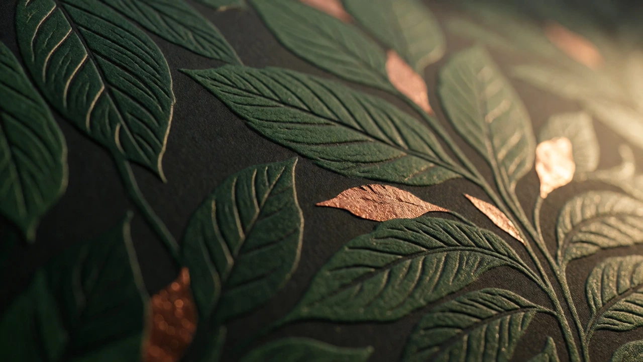
In the context of wallpaper trends, designers are moving away from flat, monochromatic looks. They are embracing high-contrast combinations. Think black-and-white geometric patterns or metallic foils against matte backgrounds. These textures catch light differently, adding another layer of visual interest that static paint cannot achieve.
Context Is Everything: Why Background Matters
You might think painting your whole living room bright red will make it the most attractive space in the house. Often, it just makes it overwhelming. The human eye seeks balance. If everything is shouting, nothing is heard.
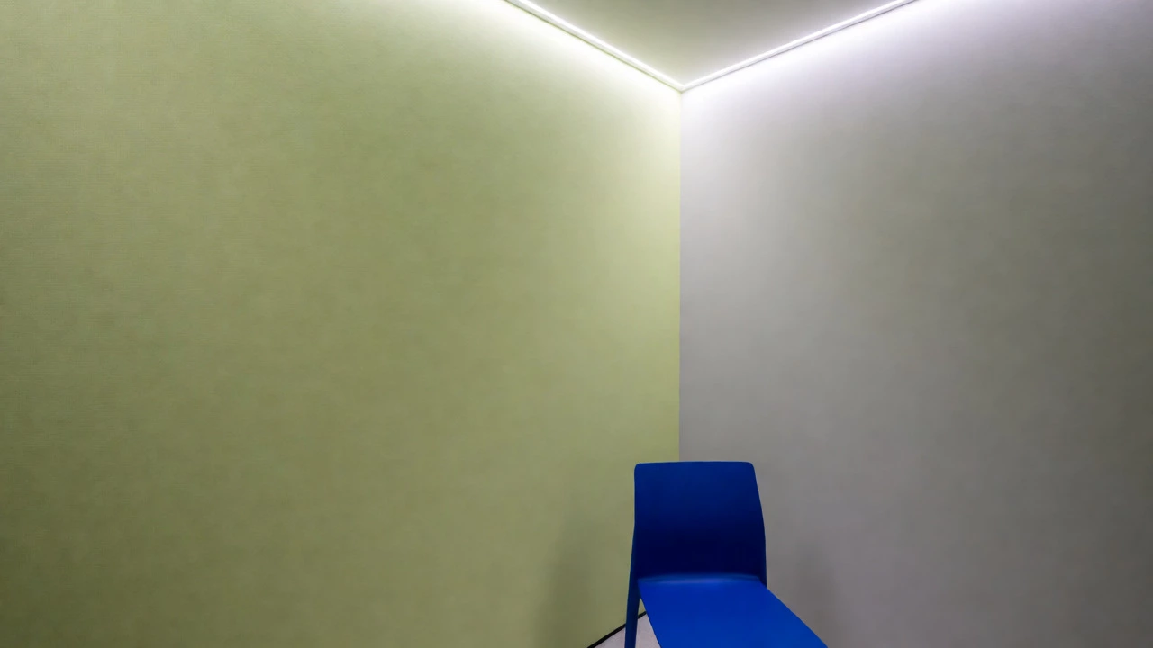
Consider the concept of figure-ground relationship. Your brain separates the object of interest (figure) from the background (ground). For wallpaper to work effectively, the pattern must stand out clearly from the surrounding elements. If you choose a busy floral print, keep your furniture simple and solid-colored. If your wallpaper is subtle, you can afford bolder upholstery.
Lighting changes everything too. Under cool daylight bulbs, blues and greens appear sharper and more vibrant. Under warm incandescent lights, reds and oranges glow intensely. Always test your wallpaper samples in the actual lighting conditions of the room before committing. What looks attractive in a store might vanish under dim hallway lamps.
Applying Psychology to Your Space
Different rooms serve different purposes, and the color attracting the eye should align with the room’s function. Here is how to apply visual psychology practically:
| Room Type | Recommended High-Impact Colors | Psychological Effect |
|---|---|---|
| Living Room | Deep Teal, Terracotta, Charcoal | Encourages conversation and social interaction without over-stimulation. |
| Kitchen | Bright Yellow, Orange Accents | Stimulates appetite and energy; great for morning routines. |
| Bedroom | Slate Blue, Lavender, Soft Grey | Promotes relaxation; avoids eye strain before sleep. |
| Home Office | Lime Green, Electric Blue | Boosts creativity and alertness; combats mental fatigue. |
Notice that none of these recommendations suggest painting an entire bedroom fire-engine red. That would likely keep you awake all night. Instead, they use color strategically. In a kitchen, a splash of yellow on a backsplash or a single accent wall draws the eye to the cooking area, making the space feel active. In a bedroom, a subtle textured wallpaper in a cool tone invites rest.
Current Wallpaper Trends Leveraging Eye-Catching Colors
As of 2026, wallpaper trends are heavily influenced by digital aesthetics and biophilic design. Two major movements dominate:
- Biophilic Maximalism: This trend uses nature-inspired colors like forest greens, earthy browns, and sky blues. However, unlike traditional minimalism, these patterns are dense and intricate. Large-scale botanical prints attract the eye because they mimic the complexity of natural environments. Our brains are wired to find comfort in these organic shapes, yet their density keeps us visually engaged.
- Retro Futurism: Expect to see neon accents, chrome finishes, and bold geometric shapes reminiscent of the 1970s and 80s. Metallic wallpapers, especially those with copper or gold foil details, reflect light dynamically. As you move through the room, the shine shifts, creating constant micro-movements that hold attention longer than matte surfaces.
These trends work because they leverage both color intensity and texture. A flat green wall is easy to ignore. A green wall covered in embossed leaf patterns that catch the afternoon sun? That becomes a focal point instantly.
Practical Tips for Choosing Your Wallpaper
Ready to pick your paper? Here are some rules of thumb to ensure your choice actually works:
- The Squint Test: Step back from your sample and squint. If the pattern blurs into a uniform blob, it lacks sufficient contrast. You want distinct areas of light and dark.
- Use the 60-30-10 Rule: Let 60% of the room be a dominant neutral color, 30% a secondary color, and 10% an accent color. Your wallpaper usually fits into the 30% or 10% category. If it’s very loud, treat it as the 10% accent.
- Consider Scale: Small rooms benefit from smaller patterns or vertical stripes that draw the eye upward, making ceilings feel higher. Large rooms can handle oversized motifs that anchor the space.
- Test Durability: High-gloss wallpapers show every fingerprint and imperfection. Matte finishes hide flaws but may dull vibrant colors. Satin offers a middle ground that reflects some light without highlighting every bump.
Remember, the goal isn’t to torture your eyes with maximum brightness. It’s to guide them. Use color to tell a story. Direct visitors to the fireplace, the artwork, or the view outside the window. When you understand what color attracts the human eye most, you stop decorating randomly and start designing intentionally.
Is red really the most attractive color for walls?
Not necessarily for entire rooms. While red grabs attention quickly, it can feel aggressive in large doses. It works best as an accent color or in dining areas where energy is desired. For bedrooms or offices, softer shades or contrasting neutrals are often more effective.
Does yellow make a room look bigger?
Yes, light yellows reflect a lot of light, which can make a small room feel airier and larger. However, intense lemon yellows can feel vibrating and chaotic. Pale butter or mustard tones are safer bets for expanding perceived space while maintaining visual interest.
How does lighting affect wallpaper color perception?
Lighting drastically changes how colors appear. Warm light (2700K-3000K) enhances reds, oranges, and yellows, making them richer. Cool light (4000K+) boosts blues and greens. Always view your wallpaper samples under the specific lighting fixtures installed in the room to avoid surprises.
Can dark colors make a room feel smaller?
Dark colors absorb light, which can make boundaries feel closer. However, using dark wallpaper on all four walls can blur the corners, creating an infinite feel rather than a cramped one. It depends on the ceiling height and window placement. High ceilings mitigate the shrinking effect of dark walls.
What is the best color combination for modern wallpaper?
High-contrast pairs are trending. Black and white remains timeless. Navy and gold offer luxury. Sage green and terracotta provide a natural, grounded feel. The key is ensuring there is enough difference in value (lightness vs. darkness) between the two colors so the pattern pops.