What Color Is Replacing Gray in Wall Art?
Beige is replacing gray as the go-to color for wall art, offering warmth, depth, and calm. Modern beige tones bring life to spaces without overwhelming them, making homes feel more inviting and grounded.
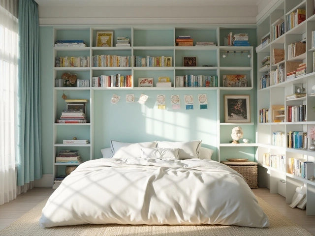
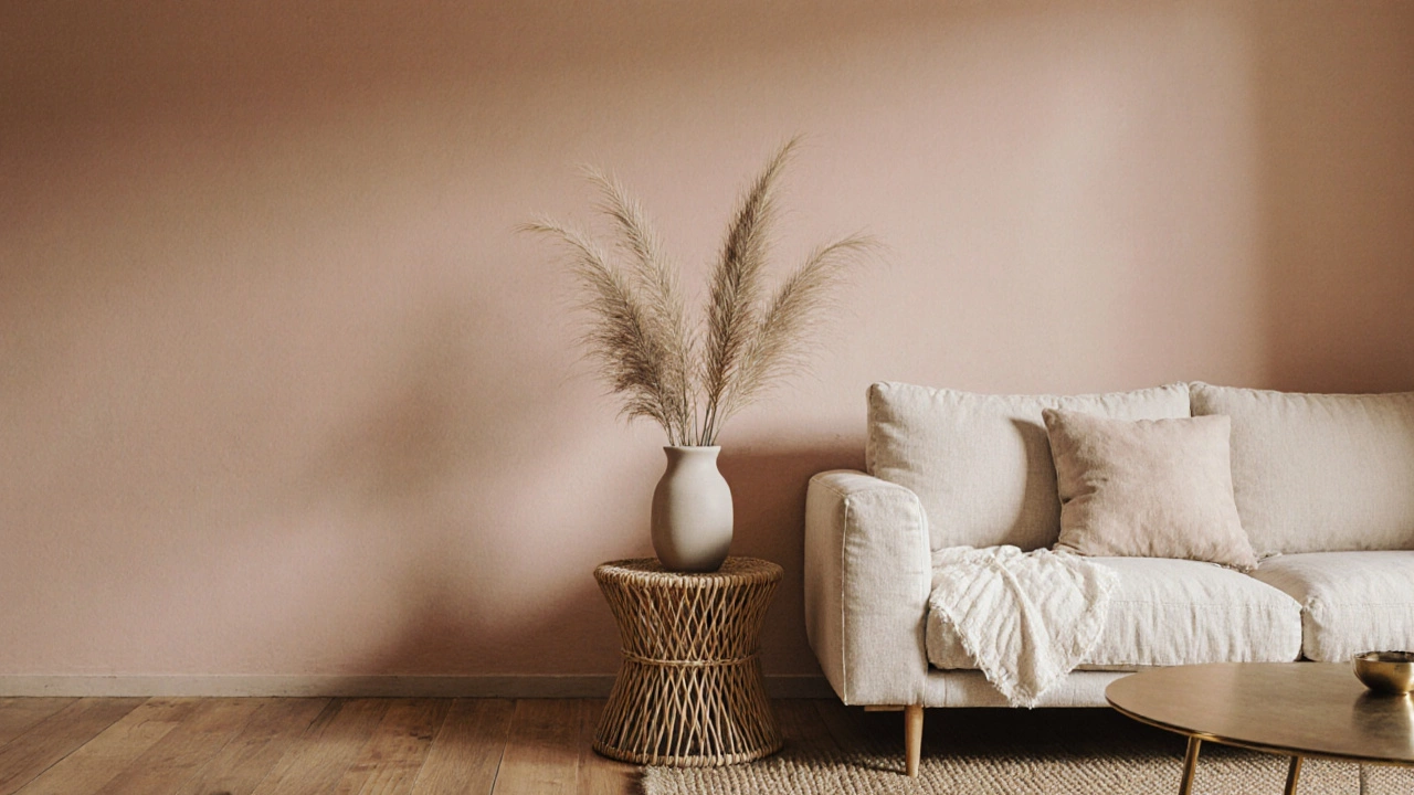
When you think of a home that feels like a hug, you’re probably thinking of warm neutrals, a range of soft, earthy tones like beige, taupe, cream, and warm gray that ground a space without feeling flat. Also known as earthy neutrals, these colors don’t shout—they whisper, making rooms feel calm, intentional, and endlessly adaptable. Unlike cool grays or stark whites that can feel clinical, warm neutrals carry a subtle golden or reddish undertone that mimics natural light and aged wood. They’re the quiet backbone of interiors that last decades, not just seasons.
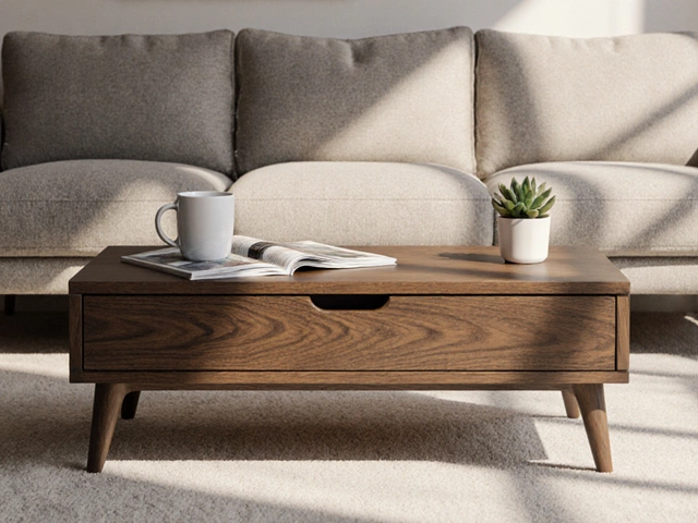
These tones don’t work alone. They’re built to partner with natural materials, like solid wood, linen, wool, and stone that add texture and depth. Think of a beige sofa next to a walnut coffee table, or cream curtains brushing against a terracotta tile floor. That’s where the magic happens. Warm neutrals also play well with lighting, especially warm LED bulbs and candlelight, which enhance their richness instead of washing them out. You don’t need bold accents to make a room feel alive—just the right balance of light, texture, and tone.
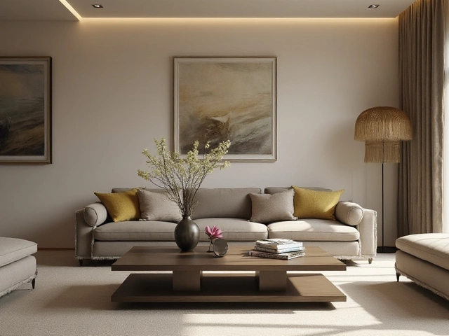
People often worry warm neutrals are boring, but they’re anything but. They’re the canvas that lets your favorite rug, artwork, or vintage chair stand out. A deep olive green armchair pops against a taupe wall. A brass lamp glows like a jewel on a cream side table. These tones make spaces feel collected, not curated. They’re the reason a 1970s living room still feels cozy today, and why modern homes with warm neutrals feel like they’ve always been there.
What you’ll find in the posts below isn’t a list of paint swatches—it’s real-world proof. You’ll see how warm neutrals work in dining rooms, living spaces, and even outdoor setups. There are tips on avoiding the "muddy" look, how to layer textures without chaos, and why some people swear by cream over white. You’ll learn what happens when you pair them with dark wood, how to use them in small rooms, and why they’re the top choice for homes that want to feel expensive without trying too hard. No fluff. Just practical, tested ideas from people who live with these colors every day.
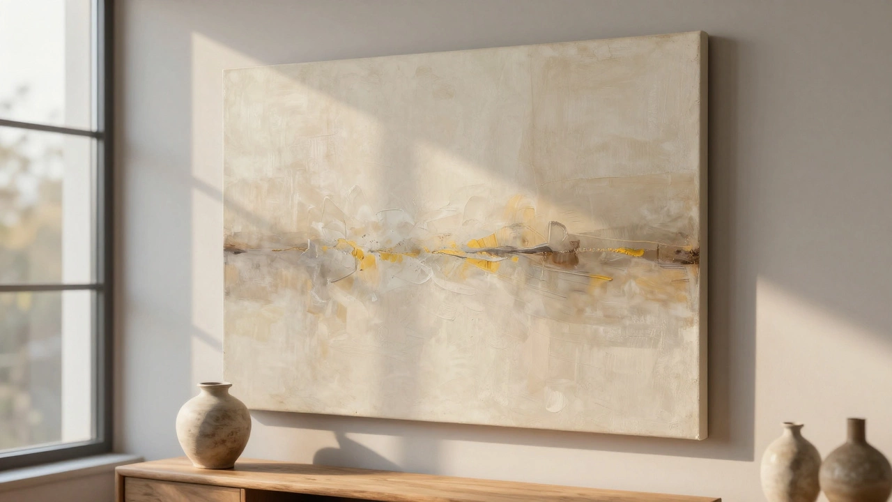
Beige is replacing gray as the go-to color for wall art, offering warmth, depth, and calm. Modern beige tones bring life to spaces without overwhelming them, making homes feel more inviting and grounded.
Beige is replacing gray as the go-to neutral in 2025 interiors, offering warmth, texture, and calm. Learn why designers and homeowners are switching, which shades work best, and how to style it with furniture.