Ever walked into a room and immediately felt something was just right? Chances are, the color scheme was spot on. When it comes to bookshelves, the color you choose can shift the vibe of an entire space. But, finding that perfect hue? It's all about balance. It's not just about picking a shade that screams 'you', but one that vibes with everything else going on in the room.
First off, think about what mood you want to set. Do you want your bookshelf to pop with vibrant colors, drawing all eyes to it, or do you prefer a relaxed feel where it blends seamlessly with the surroundings? Each choice tells a different story. For instance, dark blues or greens can give a sophisticated touch, while lighter hues like whites and pastels tend to open up a space, making it feel airy.
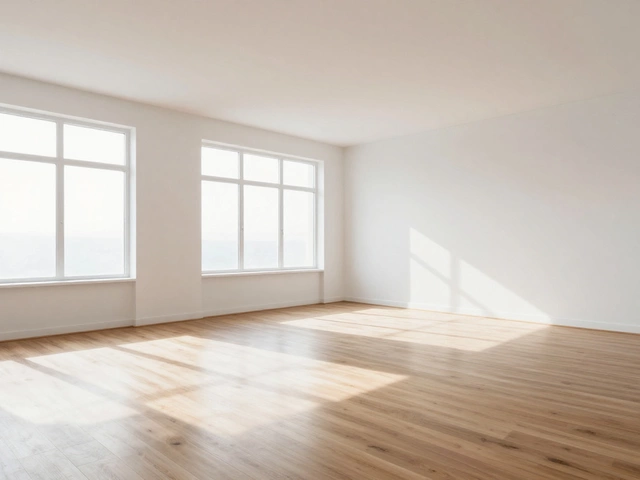
It's also smart to consider lighting. Natural light will bounce off lighter colors, making the room brighter, while darker colors might absorb light, adding a cozy, intimate feel. So if you’re working with a dim space, you might opt for a brighter color to lift it up a bit.
- Understanding Color Psychology
- Matching Room Aesthetics
- Popular Bookshelf Colors
- Lighting and Color Dynamics
- DIY Bookshelf Painting Tips
- Color Inspiration from Designers
Understanding Color Psychology
When picking a color for your bookshelf, diving into color psychology can be a game-changer. Different colors can evoke various emotions and set different vibes in a room. This is why choosing the right shade isn't just about what looks good but also about how it makes you feel and how it might impact the space overall.
For starters, blue is known for its calming and soothing effects. It’s great for spaces where you want to unwind, like a reading nook. If you're all about turning your bookshelf into a stress-free zone, this might be your go-to.
Red, on the other hand, is the color of energy and excitement. It can make a bold statement but might feel a bit intense if overdone. People usually love it in spaces meant for lively discussions or where you want to add energy.
Then there’s green, which offers a refreshing and balanced vibe. Being associated with nature, it can bring a sense of tranquility and can work wonders in any room, especially if you're trying to create a peaceful and harmonizing feel.
Yellow is all about sunshine and optimism. It can instantly brighten up a room and lift your spirits. Just the right amount can keep a space cheery without overwhelming it.
Finally, you've got your neutral colors, like whites and grays, which are the ultimate chameleons of interior design. They blend well with almost anything and provide a clean backdrop that lets your books or decor stand out.
So, think about what kind of vibe you want your bookshelf to give off. It's not just a piece of furniture; it's a statement. By choosing the right color, you'll not only be investing in your home’s aesthetic but also in how it makes you and others feel.
Matching Room Aesthetics
Choosing a bookshelf color isn't just about what looks cool; it's about what works well with the room's overall vibe. Think of it like picking a perfect puzzle piece. The first step is to consider the existing style and color scheme of the room. Do you have a modern minimalist look with neutral tones, a rustic farmhouse style, or maybe something more eclectic and colorful? Recognizing the theme and palette helps you pick a bookshelf color that fits like a glove.
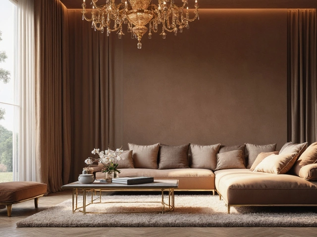
If your room is all about calm and simplicity with whites and creams, adding a bookshelf in a warm wood tone or soft grey could keep that easy-going feel intact. For rooms with bold colors, you might complement this with a dark blue or deep green shelf to balance things out. Alternatively, a crisp white bookshelf can act as a neutral anchor, allowing colorful decor or books to stand out.
Next, consider the room's functionality. Is it a cozy reading nook or a bustling living area? Shelves in shades of calming blues or greens might help create a serene space, ideal for concentration and relaxation. On the flip side, energetic colors like reds and oranges can spur conversation and activity, which might fit a lively family room better.
Don’t forget, you’re not limited to stock colors. If you're feeling adventurous, painting your bookshelf in a custom color that ties in various elements of your room can make everything come together beautifully. It's about harmonizing the visuals so the bookshelf doesn't just stand there awkwardly but feels like it belongs.
Remember, the goal is to complement, not clash. When in doubt, test out a few swatches to see how they look against your walls and under your room's lighting. It’s like trying on clothes; you want to find that fit that feels just right.
Popular Bookshelf Colors
Picking the right color for your bookshelf can instantly elevate your room's style. Seriously, a color update is like giving your bookshelf a new personality. But where to start? Let's break down some popular color choices that can fit a variety of tastes and spaces.
White bookshelves are a classic choice and for good reason. They're super versatile and can make any space feel bigger and brighter. Plus, they provide a clean backdrop that highlights your books and decor.
On the other end of the spectrum, black bookshelves add a touch of elegance and can make a strong statement. Though they might give a smaller space a cozy, intimate vibe, black can surprisingly still work wonders in making colorful book spines pop.
A well-chosen bookshelf color can be the silent hero of room design, acting as both a functional element and a work of art. — Interior design expert, Jane Doe
Looking for something more vibrant? Blues and greens are also trending. Dark shades of blue can add sophistication, while lighter blues offer tranquility. Green, especially deep forest greens, can bring a hint of nature indoors, perfect for a calming effect.
If you're after a warmer feel, consider shades like gray or even a rich tan. These neutrals work great if you want your room to feel cozy and inviting. They offer a middle ground between the drama of black and the brightness of white.
- White: Bright and airy, excellent for expanding space appearance.
- Black: Bold and elegant, makes a strong visual statement.
- Blue: Sophisticated or calming, depending on the shade.
- Green: Natural and soothing, perfect for a tranquil setting.
- Gray/Tan: Neutral coziness that complements most decor styles.
With so many options, the best way is to think about what mood you're chasing and what compliments your existing decor. This makes all the difference in achieving that just-right look.

Lighting and Color Dynamics
Alright, let's dive into how lighting plays a huge role in picking the right color for your bookshelf. Not all colors look the same in different lightings, and understanding this can save you from a design disaster!
Consider this: colors change depending on whether they're hit by natural or artificial light. In rooms with plenty of natural light, in the morning, colors can seem cooler and more vibrant. Sunny afternoons add warmth, so that beige bookshelf might look more like honey in the sun! On the flip side, relying on artificial lighting can flatten out colors. So, a sleek, dark navy can appear almost black under dim lights.
To make sure the color of your bookshelf enhances your space, consider the following tips:
- Test Samples: Whatever color you lean toward, try painting a small section of your bookshelf or a piece of cardboard. Move it around the room to see it in different lighting at different times of the day.
- Warm vs. Cool Lighting: Cool white LED lights can make cooler shades like grey or blue seem crisper, while warm lights enhance earth tones.
- Positioning Matters: If your bookshelf sits directly in front of a window, the color will almost always appear more washed out because of the direct sunlight.
Let’s say you're all about those soothing pastels. In well-lit spaces, they pop just the right amount, adding subtle elegance without stealing the spotlight. But, if you're working with a darker corner, they might get lost. Maybe a bold or darker shade would hold its own better there.
Real talk – it's about making sure the color and the light in your room are best buddies. So play around, move things, switch lights, and find the combo that makes your bookshelf look epic. And remember, sometimes all it takes is a little experimenting to find that sweet spot where everything just clicks.
DIY Bookshelf Painting Tips
So, you're itching to give your bookshelf a fresh splash of color? Awesome choice! Painting your bookshelf is a fun and budget-friendly way to revamp your space. But, before you dive in, let's go over some handy tips that'll make the process a breeze.
First things first, you've got to prep your bookshelf. Sanding is your buddy here. It helps the paint stick better and removes any nasty bumps. Use a medium-grit sandpaper to smooth things out, and don't skip this step—it’s crucial!
Next up, pick a primer that suits your bookshelf material. If your bookshelf is wooden, an oil-based primer works wonders. For laminate, a shellac-based primer gives the best grip. A quick coat of primer ensures that your color of choice pops and stays put.
Now, let’s talk about choosing the right paint. For a long-lasting finish, go for a durable paint. Semi-gloss or gloss paints are ideal since they create a sleek look and are easy to wipe clean. If you're all about the matte style, just remember it might be a bit harder to clean.
Here's a simple step-by-step guide to painting your bookshelf like a pro:
- Lay down a drop cloth to avoid any mess.
- Remove the shelves and hardware. Tape off any areas you don't want to paint.
- Apply primer evenly with a brush or roller. Let it dry completely.
- Use your chosen paint and start with light, even coats. More thin coats are better than one heavy coat.
- Let each layer dry thoroughly before moving on to the next to avoid any tacky spots.
- Finally, once your masterpiece is dry, reassemble the shelves and style it with your books and goodies.
Remember, patience is key! Rushing through this can lead to unsightly drips and an uneven finish. Plus, by doing it yourself, you're not just saving money but also getting a customized piece that reflects your style.
Color Inspiration from Designers
Ever wonder how interior designers nail that 'wow' factor with bookshelf colors? It's all about blending creativity with a strategic approach. Designers frequently look to timeless palettes while also experimenting with trending shades to find that perfect balance.
One go-to favorite among designers is the classic black or deep navy. These colors work brilliantly as a backdrop for bright book spines or metallic decor, creating a striking contrast. A renowned designer, Emily Henderson, often recommends these shades for modern spaces, emphasizing their versatility in adding sophistication without being overpowering.
Meanwhile, Benjamin Moore's color experts highlight the use of 'Silver Satin' for bookshelves. This soft grey can mesh seamlessly with various interior styles, from contemporary to rustic. It provides a neutral backdrop that allows artwork and accessories to shine.
For the more adventurous, designers like Nate Berkus suggest pastel shades like mint or blush. These are perfect for creating a playful, fresh look, especially in kids' rooms or eclectic home offices. Pastels can add a touch of whimsy while still maintaining elegance.
And let's not forget the natural trend. Earthy tones such as taupe or terracotta are making a comeback. Joanna Gaines, known for her rustic chic designs, often incorporates natural colors that warm up a space without overwhelming it. This choice is perfect for pairing with wood and plant textures, creating a cozy, grounded vibe.
To help share their insights, here's a quick look into what colors designers are enjoying right now:
- Deep Navy: A sophisticated and bold choice.
- Silver Satin: Neutral and versatile for any room.
- Mint Green: Refreshing and fun, ideal for creative spaces.
- Terracotta: Warm and earthy for a cozy feel.
Considering these designer-approved ideas can turn your bookshelf from ordinary to extraordinary. So, next time you're pondering which shade to paint your bookshelf, think like a designer, and mix that personal touch with these pro tips!