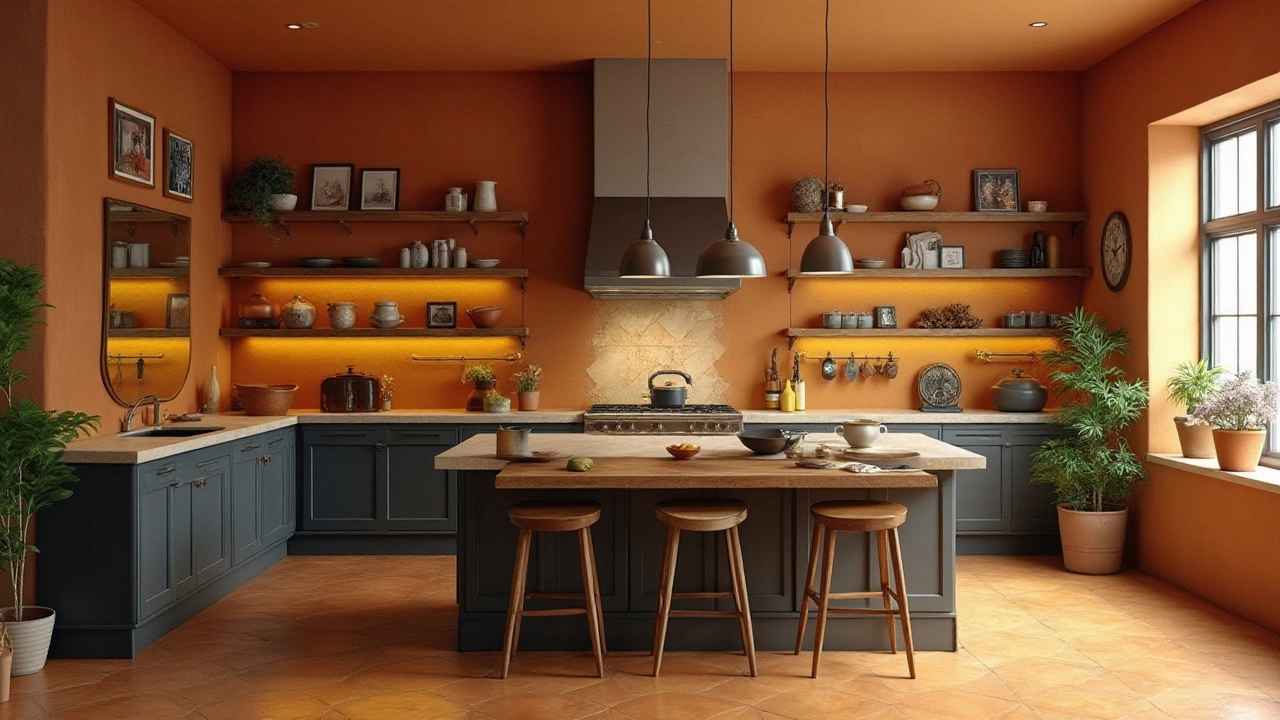
When stepping into a beautifully designed kitchen, you might feel a sense of balance and warmth without quite knowing why. One secret behind this magic is the 60-30-10 rule, a classic interior design technique that guides you in creating a harmonious color palette.
This rule is all about proportions, advising you to use 60% of a dominant color, pepper in 30% of a secondary hue, and finish with 10% of an accent shade. Though it may sound simple, when applied thoughtfully, this approach can transform your kitchen into a space that's both stylish and inviting.
In this article, we'll delve into practical ways to incorporate this rule into your kitchen design, ensuring every element works together to form a cohesive and appealing look. From choosing your base color to finding the perfect accent, let’s explore how to create a kitchen you’ll love to spend time in.
- Understanding the 60-30-10 Rule
- Applying the Rule in Your Kitchen
- Choosing Your Dominant Color
- Selecting Your Secondary Color
- Incorporating an Accent Color
- Tips for Personalizing the Rule
Understanding the 60-30-10 Rule
The 60-30-10 rule is more than just a color distribution strategy; it's a time-tested technique that has subtly but significantly impacted the world of interior design. This magical balance seems to govern the rooms that exude a sense of completeness and unity. The fundamental idea revolves around assigning 60% of a space's color to a dominant shade, offering the backdrop that sets the scene. Typically, this might be the color of the walls or a large section of the furnishings. Its role is akin to a canvas that holds the entire picture together. The challenge, however, lies in choosing a hue that complements various tones, which is why neutral colors such as whites, beiges, and grays have long been popular choices.
The 30% segment of this rule introduces a secondary color, a supporting role yet critical in painting the overall picture. Often seen as the color of upholstery, curtains, or even cabinets, this hue adds diversity and interest, requiring careful consideration to harmonize with the dominant color. What makes this particularly intriguing is its dual role in both complementing the primary color and creating contrast. Designers often opt for soft hues or pastel versions of the dominant color for this section, enhancing visual appeal without clashing. Peppering the right amount of secondary tone requires experience, creativity, and sometimes a sense of daring.
Eventually, the 10% part steps in to introduce an accent to the space, a color splash that captures attention and creates excitement. Be it through decorative elements like cushions, artworks, or even small appliances in a kitchen setting, the accent provides personality and character. In kitchens, this might be where you find brighter hues like a vibrant teal or sunny yellow. The challenge here is the striking balance between too much and too little, and it's this 10% that often dictates the mood of the space. It’s like the cherry on top of a carefully crafted dessert.
There's a widespread myth that insists the rule is rigid and formulaic, yet in reality, it offers a flexible guideline rather than a strict framework.
"The 60-30-10 rule shouldn't be seen as a constraint but as a springboard for creativity," says renowned designer Jane Lockhart. "It’s about structuring the chaos of unlimited options into something cohesive and beautiful." Indeed, the beauty of this method lies in its adaptability, allowing personal touches while maintaining a sense of underlying order.While traditionally associated with colors, the 60-30-10 rule extends its utility to textures and finishes. Imagine a kitchen where 60% might involve matte surfaces, 30% polished, and 10% metallic accents. Such an approach can break monotony while maintaining visual harmony. It transforms the kitchen design landscape into one of possibility rather than limitation, encouraging experimentation within an established framework. For those hesitant to experiment with vibrant colors, this approach offers a reliable pathway, gently ushering them into novel design territory.
Architecture enthusiasts often note the correlation between the 60-30-10 color proportion and well-balanced art compositions, evidencing the rule's universality. If split into a pie chart, the 60-30-10 division becomes clear, emphasizing balance over boldness. Such proportional representation reflects enduring principles that have spanned centuries of aesthetic design. Therefore, employing this method in kitchen design ensures a beautiful and functional space, integrating visual appeal with utility.
Applying the Rule in Your Kitchen
Transforming your cooking space with the 60-30-10 rule isn't just about sprinkling some colors around. It's a process that requires understanding how different hues interact with light, texture, and the other design elements already present in your kitchen. Begin by examining the existing features, such as countertops, cabinetry, and backsplash, to identify where the dominant, secondary, and accent colors can be applied effectively. The key is balance, and while the rule acts as a guideline, personalization can make your kitchen uniquely yours.
Most designers agree that starting with the largest areas is essential. The 60% dominant color should ideally cover elements like walls and large cabinets. It should be a color that complements your kitchen's natural light and one that feels inviting. For example, whites and grays often make excellent choices for a clean, timeless look. According to Jessica Shaw, a well-regarded interior designer, "Playing safe with a neutral dominant color opens up avenues for creative accents."
Moving on to the secondary color, which occupies 30% of your kitchen, consider using it for furniture, flooring, or even massive appliances. This color should stand out yet remain harmonious with the dominant shade. Think of colors that add warmth and depth, such as muted greens or earthy browns. Subtly differing shades can add texture and dimension without overpowering the space. This is where the flexibility of the rule shines, allowing personalization to fit your taste.
The most playful part, the 10% accent color, can transform yet another dimension of your kitchen design. Strategically use accents in smaller decor items like dishes, pictures, or a patterned rug. These elements can change as the seasons do, offering a refreshing new look whenever the mood aligns. Bright hues or metallic finishes, such as copper or bronze, introduce character without dominating the overall aesthetic. The key is moderation – too little can seem underwhelming, but too much can disrupt the visual harmony.
Here's an intriguing fact for those who love to look into numbers. A survey by Houzz showed that 48% of homeowners plan to update their kitchens, with color being one of the top reasons for renovation. Understanding these trends can help make an educated choice in color schemes that not only fit your preferences but can be appealing for potential buyers in the future.
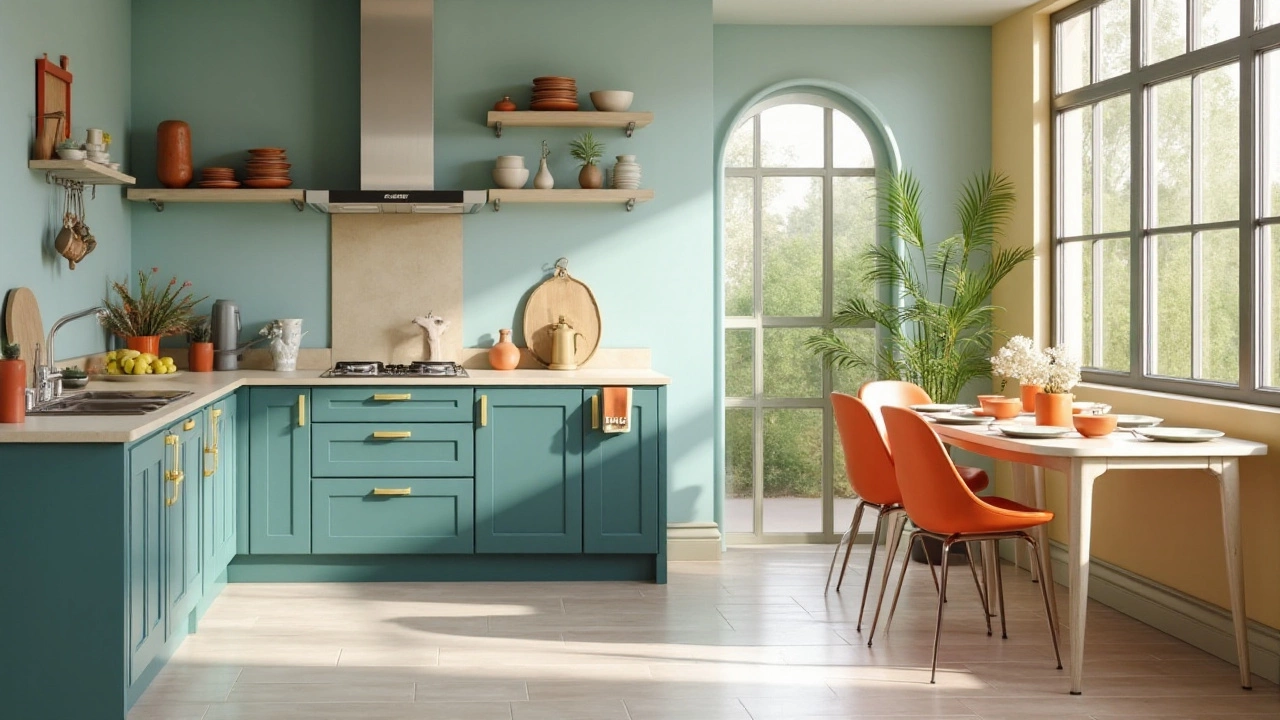
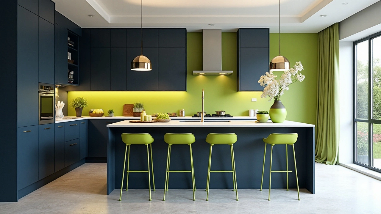
Color % of Usage Dominant 60% Secondary 30% Accent 10% The 60-30-10 rule in kitchen design transcends beyond mere aesthetics. It is about creating an environment that invites, inspires, and endures. Remember, these are guidelines rather than rigid rules. Feel free to adjust as you see fit and let your personality shine through your space. This balance is what creates that je ne sais quoi charm, making your kitchen not just a room, but the heart of your home.
Choosing Your Dominant Color
Setting the stage for your kitchen overhaul starts with picking the right base shade. Known as the 'dominant color,' this will cover 60% of your kitchen's visual space and should be something that makes you feel both comfortable and inspired in your cooking hub. Begin by considering what colors you naturally gravitate toward in other parts of your life. If you constantly wear blues, enjoy sitting in your green living room, or adore yellows that mimic sunshine, these might be clues. Taking cues from your existing favorites ensures you'll enjoy the space more.
It's vital to think about how color influences mood and appetite. Warm tones like reds and oranges have been shown to boost appetite and energy levels, while cooler colors such as blues and greens can be calming and soothing. A kitchen design expert might tell you that neutrals are often a safe bet -- whites, grays, and beiges provide a clean slate that can make any space feel larger and brighter. They also have the unique ability to adapt with the seasons as changing decor elements or personal tastes evolve.
When deciding on a dominant color, take into account the kitchen's exposure to natural light. A north-facing kitchen with limited sunlight may benefit from warmer tones, providing an artificial sense of warmth and light. Whereas spaces drenched in southern exposure could be balanced with cool or muted tones to quell any overpowering brightness.
“A room should never allow the eye to settle in one place. It should smile at you and create fantasy.” – Juan MontoyaFor those looking to align their home improvement projects with current design trends, dusty blues, deep emeralds, and sophisticated off-whites are all the rage this year. These hues bring a sense of tranquility and can beautifully blend with different decorative themes, whether you're going for a modern farmhouse look or a sleek contemporary design. But, as trends come and go, prioritize what will bring you the most joy; the kitchen should be an expression of you.
Once you've settled on a potential color, sample it. Paint a small, inconspicuous area, or if you prefer, use large swatches. See how the color reacts to your kitchen setting during different times of the day. Does morning light reveal unexpected undertones, or does evening light transform it into something unexpected? This practice can save you from the potential heartbreak of buyer's remorse and ensure that the shade chosen enhances your space all day long.
Matching your dominant color with the existing fixtures and features is another important consideration. If you have beautiful wooden cabinetry or hardware, contrast them with a backdrop color that will allow them to shine. For those planning on introducing metal elements such as copper sinks or stainless steel appliances, thoughtfully pairing them with your chosen color can make them pop or blend seamlessly.
Matching Your Flooring and Countertops
Pay attention to the relationship between your dominant color and the materials in your kitchen. This includes flooring and countertops, as their broad coverage means they can either clash with or complement your palette magnificently. Opt for harmonious hues that allow these larger surfaces to meld into your overall color scheme, creating a visual flow through the room. Imagine a light blue wall set against soft gray granite countertops or a subtle taupe tone complementing oak floors.
Remember that your dominant color will be the touchstone for layers of personality added through your 30% secondary color and 10% accent color. Choose wisely, as this choice is not just about appearance, it will shape how you feel about, and interact with, your kitchen. Let your selection speak to who you are, balancing aesthetic appeal with functional comfort.
Selecting Your Secondary Color
When you're furnishing a kitchen, your gaze should linger on the hues that provide tranquility and depth beyond the primary tone. This is where the secondary color comes into play; it's the 30% that ties the dominant color to the space, providing a comforting contrast without overpowering it. As such, the selection of this color relies heavily on balance—enough contrast to add interest, but not so much that it becomes a distraction. Typically, this color choice can be applied to elements such as cabinetry, kitchen islands, and larger appliances like your refrigerator or stovetop, forming a layer that complements your base choice.
Choosing a secondary color involves observing the natural elements and the existing features in your home. If your dominant color is a warm shade like beige or cream, a cooler secondary hue—a hazy slate blue or a soft grey—can bring the needed respite and sophistication. Likewise, a bold kitchen reflecting a base of dark, earthy brown tones can be beautifully accentuated with a secondary choice of deep moss green or a muted copper, both anchoring and contrasting in a refined conversation. The goal, always, is visual richness that is both inviting and enduring.
Before you decide, consider how different colors interact under varied light conditions. A secondary tone that seems perfect in daylight might have a different character under artificial lighting during evening meals. Experimentation is invaluable: test paint samples and material pieces in diverse spots of your kitchen at several times of the day to truly gauge how the shade fits. This practice ensures that the chosen color not only feels right aesthetically but aligns emotionally with the ambiance you wish to nurture in your cooking space.
During this phase, remember the wisdom of Sarah Richardson, a notable interior designer who said,
If you put too much of a good thing in one room, it's just not good anymore.This illustrates the importance of balance, emphasizing moderation in the 60-30-10 equation, essential for maintaining allure and cohesion in your kitchen design.Additionally, the role of texture is paramount. A glossy finish on your secondary color can refine a modern kitchen, bringing in elements of sleek style and cleanliness. Conversely, a matte finish might suit a rustic or vintage-inspired kitchen while adding warmth and depth. To further personalize, consider incorporating patterns or textures through backsplashes and tiling—elements that form the secondary color palette, adding dimension and visual rhythm to your kitchen decor.
It pays off to even consider the unexpected. Perhaps a daring secondary color like a deep teal or burnt orange feels adventurous, but paired smartly, it can elevate a kitchen's aesthetic from simple shelter to statement piece. Bear in mind the full spectrum you can explore within this 30%—from muted pastels to vibrant jewel tones—and mix creativity with pragmatism for an environment that embodies both form and function.
If color choices are overwhelming, color theory tools like a color wheel can be a strategic companion. They offer insight into complementary and analogous color schemes valuable in guiding your selection. And as with every significant home improvement project, your kitchen design remains a personal journey of discovery and expression. By aligning this phase with your tastes and the overarching theme, you ensure the secondary color not only complements but elevates the kitchen design story you're crafting.
Incorporating an Accent Color
In the realm of kitchen design, an accent color is the pièce de résistance that exudes personality and flair. It's that splash of vibrance amidst the foundational tones, capturing attention and drawing the eye to specific areas or elements. But the art of incorporating it effectively into your kitchen can mean the difference between a well-placed pop and a chaotic eyesore. Let's start with the role of accent colors. They serve as the garnish on a dish, meant to enhance the main and secondary hues without overpowering them. An accent color constitutes approximately 10% of your kitchen's color palette, making it a strategic choice where less is often more.
When choosing this decor rule, think of staying under a cohesive theme. Common kitchen accent colors include hues like teal, mustard, or even metallics like brass or copper. These colors should ideally complement your primary and secondary choices, creating delightful contrasts without speaking over them. Consider incorporating these accents where they can make a real impact. Whether it's through vibrant cookware, light fixtures, or artwork, these elements reveal the personality hidden in your home. For instance, suppose your dominant color is a warm gray, and your secondary is a soft blue. Infusing a vibrant yellow as an accent can invoke a sunny look without clashing.
Some might wonder, why use just 10%? The answer aligns closely with human psychology and color theory. Our brains are wired to notice small deviations from the norm, pulling attention towards them. Thus, accents spark dynamic interest in what might otherwise feel monotonous. Select your pieces carefully, remembering that even subtle accents can make profound statements. Consider that the accent color is the smile in the room, bringing joy without being the center of attention. For those who love to consistently refresh their look, smaller items like kitchen textiles or countertop decor can be updated with ease, keeping the space lively and inviting year-round.
Injecting some expert advice, famed designer William Lawrence notes, "A kitchen that feels complete is one where the accent color seems almost like a happy accident, seamlessly blending while standing out."
It’s this kind of calculated spontaneity that resonates with our internal need for balance yet excitement," he adds.It’s worth noting the design potential of accent color through form, not just shade. Think glossy finishes or intricate patterns that echo this color, adding more depth to your kitchen design.Looking at real-world examples, research from the Design Council suggests that color can increase brand recognition by up to 80% in professional environments. So imagine its impact in your kitchen, a space often considered the heart of the home. Incorporate clever touches with cabinetry handles, or perhaps with a painted wall section. If you lean toward eclectic vibes, consider a kitchen island in the accent color, making it a deliberate centerpiece. These elements create visual intrigue and add warmth to the space, warming the hearts of everyone who steps foot there.
Ultimately, using an accent color in home improvement projects should reflect your unique style with thoughtful consideration. Experiment with placements until you find a rhythm that puts a personal stamp on your culinary haven. As you embrace this accent color journey, remember it’s an exploration of blending artistic elements with living quarters, carving out a special place where every color tells part of your story.
Tips for Personalizing the Rule
Personalizing your kitchen using the 60-30-10 rule is about injecting your own personality into the design while maintaining a balanced and classy aesthetic. It's not just about following a rigid formula; but adapting it so that it best reflects who you are in your most-used space. Start by considering the mood and vibe you want to evoke — inspiration often comes from personal experiences or places you love. Once you've got that personal touch in mind, think about integrating elements that speak to those moments, like a particular pattern from a beloved vacation destination as your accent. Remember, these choices should seamlessly blend into the existing decor and architecture of your home.
Now, let's focus on textures, which play a significant role in how any color is perceived. Mix and match different textures like matte, glossy, or even metallic surfaces, to keep your kitchen design dynamic and visually interesting. Sometimes, subtle shifts in texture can change the way a color concept is interpreted, adding depth without altering the color proportions significantly. Did you know that introducing texture through kitchen tools and utensils can also play into your color scheme? An array of wooden spoons tucked into a ceramic jar can suffice, adding both utility and a touch of visual flair, staying within your color palette quietly.
"A room should never allow the eye to settle in one place. It should smile at you and create fantasy," said Juan Montoya, a renowned interior designer.Structural features, like exposed beams, can act as great anchors for your secondary color or even take on the accent role, thus turning the rule slightly on its head while making sure that everything pulls together just right. Don't forget about the lighting, which can transform colors at different times of the day. Varying your lighting can further accentuate your chosen color scheme, creating moods that shift throughout the day.
If you're someone interested in data, consider creating a simple table that tracks how certain colors make you feel during different parts of the day. Compare this with natural light availability and popular use times of your kitchen space as follows:
Time of Day Natural Light Level Color Perception Morning High Energetic Afternoon Medium Warm Evening Low Cozy Lastly, don't shy away from seasonal adjustments. Swap out items like curtains, towels, or even place mats to reflect the changing seasons. This allows your kitchen to evolve subtly throughout the year, while still maintaining the foundational balance established by your primary colors. It's all about keeping it fresh and exciting, maintaining the essence of what makes the 60-30-10 rule so effective in kitchen design. Together, these moves will ensure your kitchen is not only a feast for the eyes but a true extension of your vibrant spirit.