What Is the 3 Color Rule in Interior Design?
The 3 color rule in interior design helps create balanced, calming spaces by using one dominant, one supporting, and one accent color. Learn how to apply it to any room for professional-looking results.
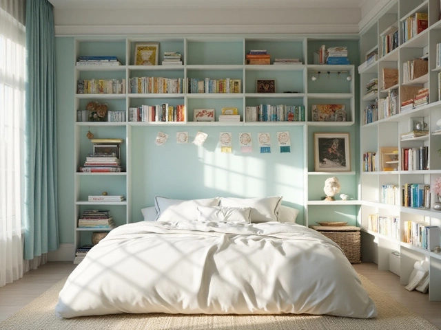
When you think about a home color scheme, a coordinated set of colors used throughout a living space to create mood, flow, and visual harmony. Also known as interior color palette, it’s not just about picking paint—it’s about how light, furniture, and materials interact to shape how you feel in a room. A good home color scheme doesn’t shout. It breathes. It makes you relax in the living room, wake up refreshed in the bedroom, and feel calm in the bathroom. And right now, it’s moving away from cool grays and sterile whites toward warmer, earthier tones that feel more human.
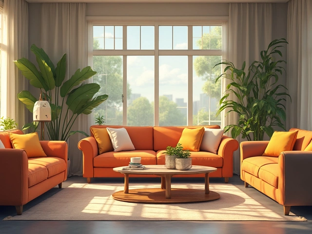
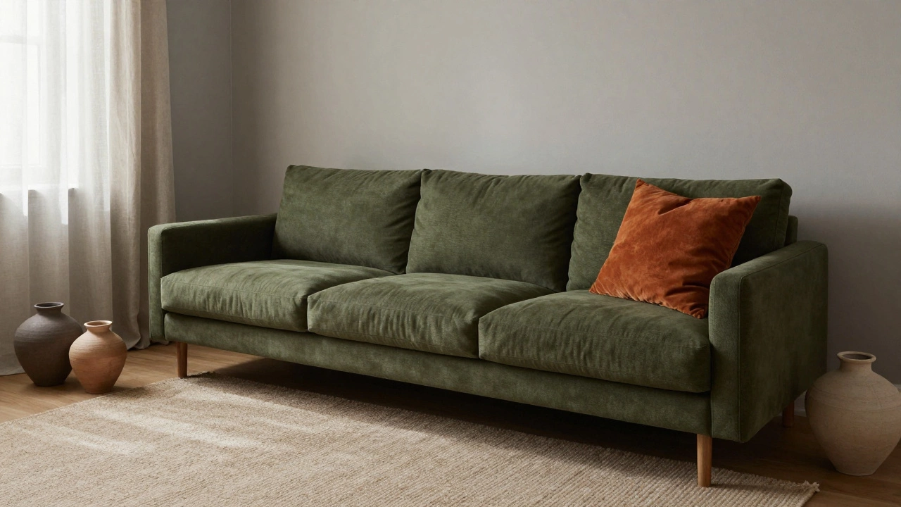
The biggest shift? beige, a warm, soft neutral that brings texture and depth without feeling flat. Also known as warm neutral, it’s replacing gray as the go-to wall color in 2025 because it works with everything—from dark wood furniture to brass fixtures and linen curtains. You’ll see it paired with earthy greens, muted, natural tones inspired by forests and moss. Also known as forest green, these shades add life without overwhelming a space. And if you want a little drama, deep navy, a rich, saturated blue that feels luxurious but not cold. Also known as navy blue, it’s showing up on kitchen cabinets, accent walls, and even ceilings because it grounds a room instead of shrinking it. These aren’t random trends. They’re responses to how people actually live now—wanting calm, not chaos, and warmth, not sterility.
What you won’t find in a good home color scheme is mismatched accents, too many competing colors, or trying to copy a Pinterest board without thinking about your own lighting. A white corner sofa looks better with navy than with pastel pink. A bathroom with charcoal walls feels more spa-like than one with bright white tiles. And curtains? The best ones don’t match the walls—they quietly hold everything together. That’s the secret: your color scheme should feel like it was always there, not like it was bought off a catalog.
Below, you’ll find real examples from real homes—how floral wallpaper fits into modern color plans, why certain shades work better in small spaces, what curtains actually go with everything, and how to pick a color that doesn’t look dated in six months. No fluff. No guesswork. Just what works.
The 3 color rule in interior design helps create balanced, calming spaces by using one dominant, one supporting, and one accent color. Learn how to apply it to any room for professional-looking results.