3-Color Rule Calculator
Calculate the correct 60-30-10 color ratio for your interior design projects. Enter your three colors, and we'll show you how they should be proportioned in your space.
Ever walk into a room and feel like something’s off-even though everything looks nice? That’s often the sign of a broken color rule. One of the simplest, most powerful tools in interior design is the 3 color rule. It’s not about being rigid. It’s about creating balance so your space feels calm, intentional, and not chaotic. This rule isn’t new, but it’s still the secret behind rooms that look like they were styled by a pro-even when you did it yourself on a weekend.
What Exactly Is the 3 Color Rule?
The 3 color rule says: use no more than three main colors in a room. That’s it. Not six. Not four. Three. These colors work together to create a visual rhythm. One is dominant, one supports it, and one adds a punch. Think of it like a song: the melody, the harmony, and the bass. Skip one, and the room feels flat. Add too many, and it becomes noise.
Here’s how it breaks down:
- 60% dominant color - This is your wall color, large sofa, or main flooring. It sets the tone.
- 30% secondary color - This complements the dominant color. Think curtains, rugs, or accent furniture.
- 10% accent color - The pop. A throw pillow, artwork, lamp, or vase. This is where personality lives.
This isn’t magic. It’s math. The 60-30-10 split gives your eyes a clear path to follow. Without it, rooms feel cluttered or visually heavy. You’ve probably seen this in magazines or Instagram posts without even realizing it. That’s because it works.
Why Does It Work So Well?
Our brains crave order. Too many colors trigger sensory overload. A 2023 study from the University of Auckland’s Design Psychology Lab found that rooms with three or fewer dominant hues were rated 47% higher in perceived calmness than those with four or more. People stayed longer. They felt more relaxed. Even the lighting felt better.
Think about your favorite café. The walls are one tone. The chairs are another. The coffee mugs? A third. That’s the 3 color rule in action. It’s not accidental. It’s designed.
When you break the rule-say, you paint the walls beige, buy a teal sofa, add mustard yellow curtains, throw in a purple rug, and hang five different colored paintings-you’re asking your brain to process too much at once. The result? Fatigue. Discomfort. Even if every piece is beautiful on its own, the whole feels messy.
How to Choose Your Three Colors
Choosing the right three colors isn’t about picking your favorites. It’s about how they relate. Start with your dominant color. This should reflect the mood you want.
- Want calm? Go for soft grays, warm beiges, or muted blues.
- Want energy? Try deep greens, terracotta, or navy.
- Want light and airy? Stick to whites, creams, or pale taupes.
Once you have that, pick a secondary color that’s either:
- Same hue, different tone - Like light blue walls with navy upholstery.
- Complementary - Opposite on the color wheel. Like sage green with blush pink.
- Analogous - Next to each other. Like beige, taupe, and warm gray.
Then, the accent color. This is where you have fun. It can be bold, unexpected, or even metallic. Gold, copper, or a bright coral can work wonders. Just keep it small. A single chair, a stack of books, or a sculpture. One or two pieces max.
Pro tip: Use the color wheel as your guide. If you’re unsure, grab a paint chip from the hardware store. Lay them side by side. If they feel like they belong together, they probably do.
Common Mistakes People Make
Even when people know the rule, they still mess it up. Here are the top three mistakes:
- Using three colors that are too similar - All neutrals. All grays. No contrast. That’s not a color scheme-it’s a beige coma. You need contrast to create depth.
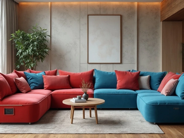
- Letting the accent color take over - A bright red sofa as your 30%? That’s not an accent. That’s the main event. Now your dominant color is lost. The room feels unbalanced.
- Ignoring lighting - Colors change under different light. A gray that looks cool in the morning turns blue at night. Always test paint swatches at different times of day. Natural light, artificial light, sunset. See how they behave.
Another trap: thinking you need to use paint for all three colors. You don’t. Your dominant color could be your rug. Your secondary could be your curtains. Your accent could be your lamp. The rule applies to materials, not just paint.
Real Examples from Real Homes
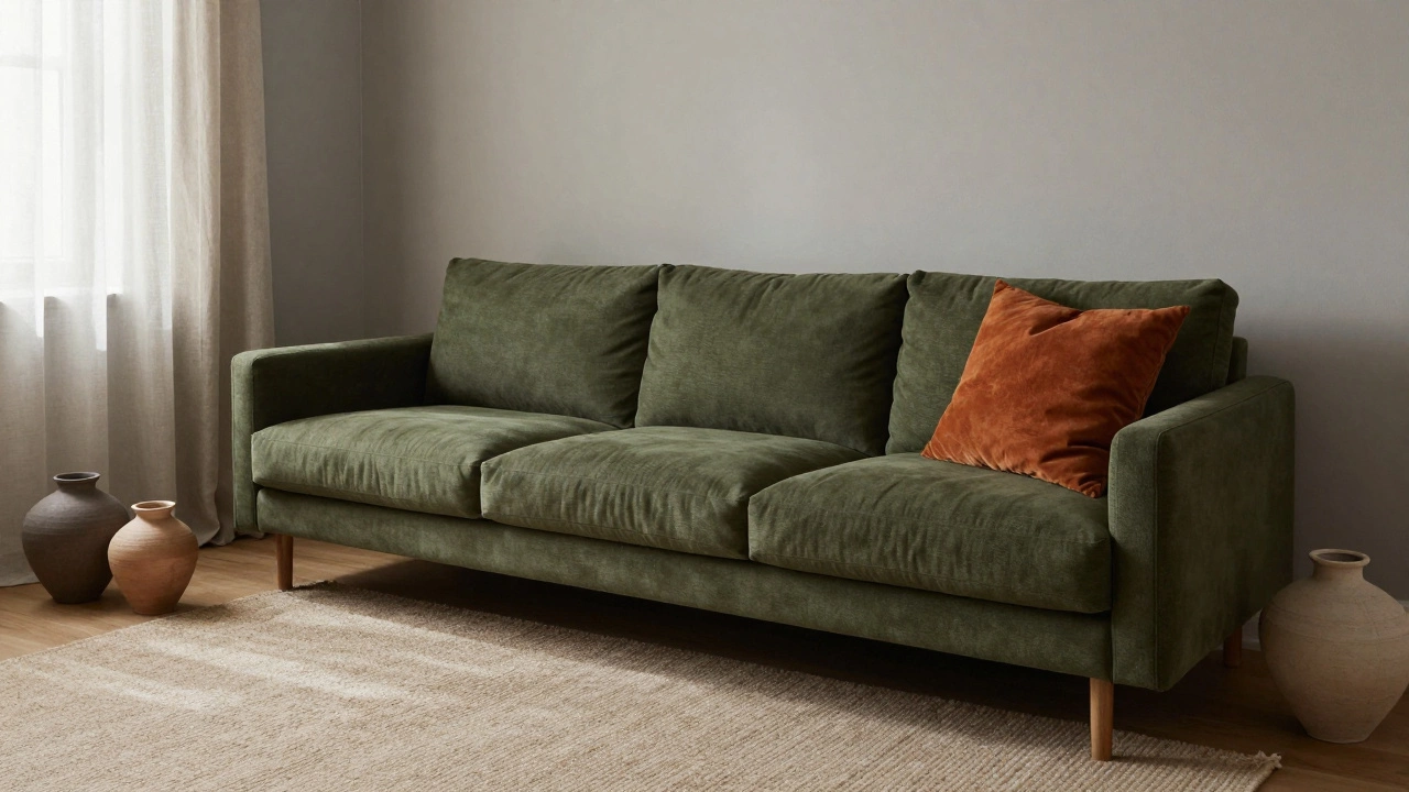
Take a living room in Wellington. Walls are a warm, mid-tone gray (60%). A deep olive green sectional (30%). And then-just one throw pillow in burnt orange (10%). That’s it. No other color. The room feels rich, grounded, and cozy. The orange doesn’t scream. It glows.
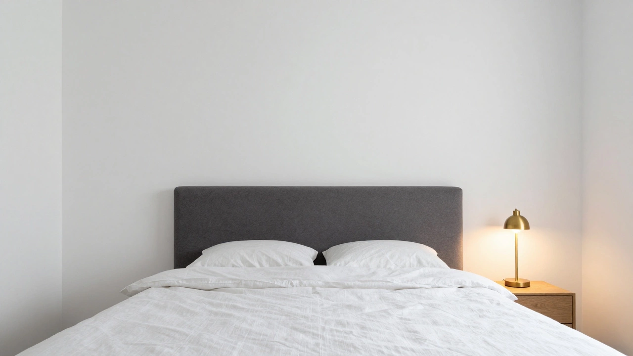
Another example: a bedroom with white walls (60%), a soft charcoal bed frame (30%), and a single brass bedside lamp (10%). No artwork. No patterned bedding. Just three colors. The space feels serene, expensive, and intentional.
Compare that to a room with white walls, a blue rug, a yellow lamp, a green plant, a pink pillow, and a red curtain. Suddenly, it’s a carnival. The 3 color rule would have cut that down to white, blue, and one punch of color-say, the lamp. Clean. Calm. Powerful.
What About Patterns and Textures?
Patterns don’t break the rule. They follow it. If your sofa has a subtle geometric print with three colors-gray, cream, and navy-it still counts as one color family. The rule applies to the color palette, not the number of patterns.
Texture is your friend. A wool rug, a linen curtain, a ceramic vase, a velvet pillow-they all add depth without adding color. You can layer textures endlessly within your three colors. That’s how you get richness without chaos.
Same goes for metallics. Gold, brass, black iron-they’re not colors. They’re finishes. You can use them freely as long as they don’t introduce a new hue. A brass lamp on a navy table? Perfect. A gold-framed mirror next to a red wall? Only if the red is your 60% and gold is part of the 10% accent.
When to Break the Rule
Rules are meant to be broken-but only after you know them well. If you’re a designer, artist, or just someone who loves boldness, you can stretch the rule. But here’s how:
- Add a fourth color-but keep it under 5%. A single book spine, a tiny plant pot, a thread in a rug.
- Use neutral textures to absorb extra color. A white wall behind a colorful art collection makes the art feel intentional, not overwhelming.
- Use the rule room-by-room. One room can be blue and white. Another can be green and cream. That’s fine. Just don’t mix them in the same space.
The goal isn’t perfection. It’s harmony. The 3 color rule gives you structure so you can be creative without drowning in choices.
How to Test It in Your Own Space
Here’s a quick exercise. Walk into any room in your home. Look around. Now ask yourself:
- What’s the biggest color I see? That’s my 60%.
- What’s the next biggest? That’s my 30%.
- What’s the one thing that catches my eye? That’s my 10%.
If you can’t answer those three questions clearly, you’ve got too many colors. Start by removing one. Maybe it’s that bright yellow lamp. Or the patterned curtain. Replace it with something in your 60% or 30% color. See how the room changes.
Do this in one room first. Then move to the next. You’ll start seeing how powerful simplicity is.
Can I use more than three colors if I keep them muted?
Muted colors still count as colors. If you have five different shades of gray, you’re still using five colors. The 3 color rule is about limiting the number of distinct hues, not the number of tones. Stick to three base colors, even if they’re soft. That’s what creates visual rest.
Does the 3 color rule apply to kitchens and bathrooms?
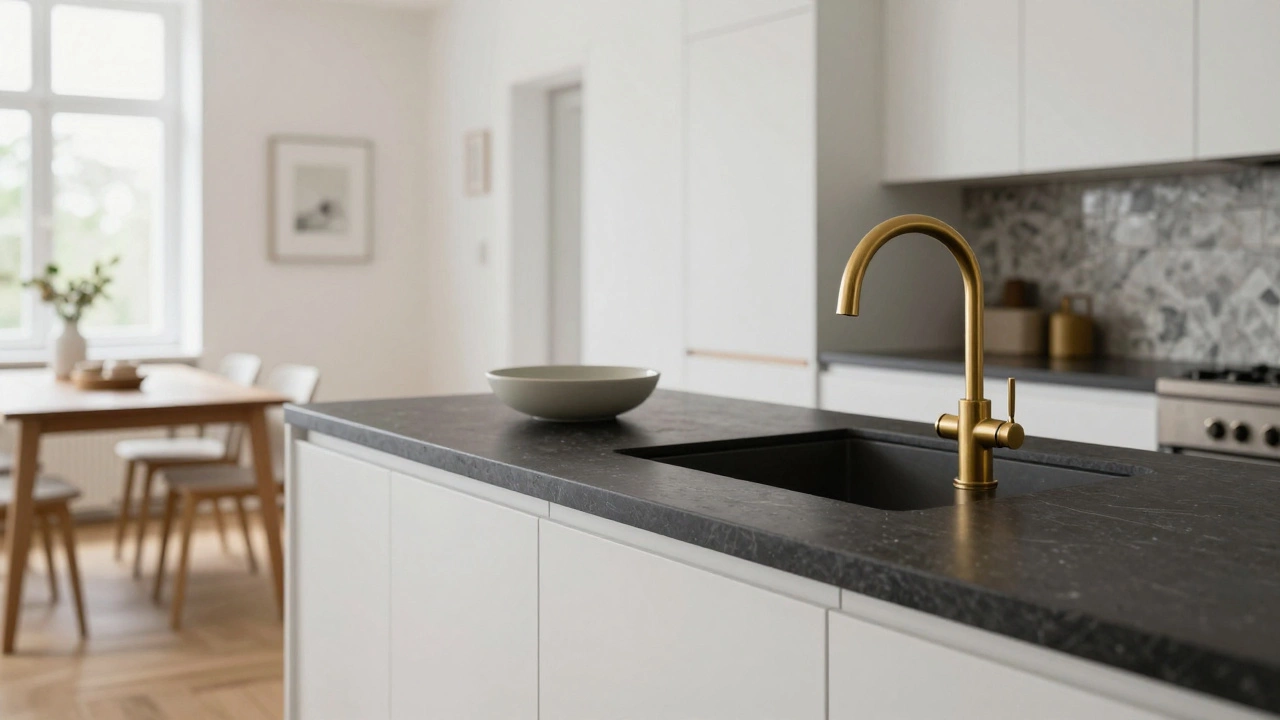
Absolutely. Kitchens and bathrooms benefit even more from this rule because they’re small spaces. Too many colors make them feel cramped. A white cabinet (60%), a dark stone countertop (30%), and a single brass faucet or towel (10%) creates a clean, spa-like feel. You don’t need colorful tiles or patterned backsplashes to make it interesting.
What if I love bold colors? Can I still use the 3 color rule?
Yes-and you should. Bold colors work best when they’re controlled. Use one bold color as your 60% (like a deep emerald wall), a neutral as your 30% (cream sofa), and a second bold color as your 10% (a bright yellow lamp). The contrast makes both colors pop without clashing. Bold doesn’t mean chaotic.
Do I need to match my furniture to my wall color?
No. In fact, it’s better if you don’t. Your dominant color is usually the background-walls, floors, large furniture. Your secondary color can be a different piece that complements it. A gray wall with a navy chair isn’t matching-it’s balancing. Matching makes a room feel flat. Contrasting makes it feel alive.
Can I use the 3 color rule in an open-plan space?
Yes, but be careful. In open-plan areas, you need to carry the same three colors throughout to avoid visual fragmentation. If your living room has blue walls and beige furniture, don’t switch to green walls in the dining area. Keep the palette consistent. You can vary the intensity or texture, but the core three colors should flow from one zone to the next.
Next Steps
Start small. Pick one room. Identify your dominant color. Then find one supporting piece. Then one accent. Take a photo. Step back. Does it feel calm? Does it feel like you? If yes, you’ve nailed it. If not, remove one thing. Repeat. This isn’t about buying new stuff. It’s about seeing what’s already there-and letting go of what doesn’t belong.
The 3 color rule isn’t a restriction. It’s a gift. It gives you freedom to focus on what really matters: comfort, character, and calm.

