Curtain Color Visualizer
Select Your Elements
Choose your wall color and furniture color to see which neutral curtains work best
Recommended Curtains
How It Works
Let’s be real - buying curtains shouldn’t feel like a geometry puzzle. You pick a shade, hang it up, and suddenly your whole room looks off. Too warm. Too cold. Too loud. Too boring. The truth? There’s one set of colors that actually works with just about every wall, sofa, rug, and lighting setup you’ve got. And no, it’s not white. Not beige. Not gray. It’s a combination of three neutral tones that have been quietly dominating homes for decades - and for good reason.
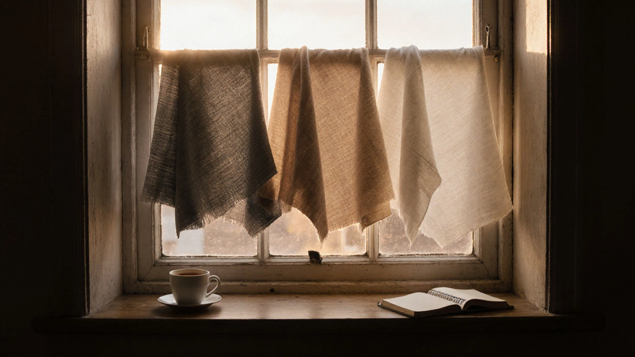
The Three Colors That Work With Everything
When you strip away trends and fads, what’s left are colors that don’t fight your space - they quietly hold it together. These aren’t fancy pigments. They’re grounded, quiet, and flexible. The winning trio? Warm Gray, Soft Taupe, and Off-White.
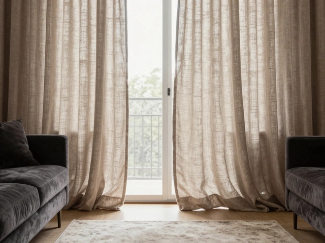
Warm gray isn’t the icy, blue-based gray you see in catalogs. It’s the kind that leans just a touch toward brown, like the color of sun-bleached linen or old concrete. It’s the perfect middle ground between cool and warm, which means it doesn’t clash with wood tones, metal finishes, or even red sofas. In Wellington homes, where natural light shifts dramatically from morning to evening, warm gray stays consistent. It doesn’t turn blue under fluorescent lights or glow too yellow in afternoon sun.
Soft taupe is where beige grew up. It’s not pastel. It’s not beige-brown. It’s a muted, dusty blend of brown, gray, and just a whisper of pink. Think of the color of well-worn leather or the inside of a coffee bean. It absorbs light gently, which makes it ideal for rooms that feel too bright or too stark. If your walls are painted a bold sage or a deep navy, taupe curtains act like a visual buffer - calming without disappearing.
Off-white is the one people mistake for plain white. But off-white has body. It’s not stark. It’s the color of old parchment, oat milk, or a linen shirt that’s been washed too many times. It’s the most forgiving color in the room. It works under skylights, next to dark floors, and even when your couch is a loud mustard yellow. The key? Make sure it’s not too creamy. Too yellow = looks dirty. Too cool = looks cold. The sweet spot is a hue with just a hint of warmth, like the inside of a seashell.
Why These Colors Work - The Science Behind the Neutral
It’s not magic. It’s color theory, simplified. Every color has three properties: hue (what you name it), saturation (how intense it is), and value (how light or dark). The universal curtain colors all share the same low saturation and medium value. That means they don’t compete. They don’t shout. They don’t reflect too much or too little light.
Think of your room as a playlist. Bold wall colors? That’s the bass. Bright rug? That’s the melody. Curtains are the rhythm section. If you pick a curtain that’s too saturated - say, emerald green or cobalt blue - it becomes the lead singer. Suddenly, the whole room is off-key. But warm gray, soft taupe, and off-white? They’re the steady drumbeat. They let everything else shine.
Studies from the Color Marketing Group show that homes with neutral window treatments retain higher resale value - not because they’re trendy, but because they’re adaptable. Buyers don’t have to re-window. They just need to swap out pillows or a rug, and the room feels fresh again.
What to Avoid - The Common Mistakes
People think “neutral” means boring. Then they go for the wrong neutrals. Here’s what doesn’t work - and why.
- Pure white curtains: They reflect too much light. In a room with south-facing windows, they glare. In low-light spaces, they look dirty. They also show every speck of dust and pet hair.
- Beige: Too yellow. Too generic. It clashes with warm wood floors and looks dated next to modern furniture. It’s the color of 1990s hotel rooms.
- Black curtains: They absorb light like a sponge. They make rooms feel smaller. They’re dramatic - but only if your whole room is designed to be moody. Most aren’t.
- Patterned neutrals: Stripes, plaids, or subtle florals in beige or gray? They’re not neutral anymore. They’re design elements. And they demand attention. You want curtains that fade into the background, not ones that become the focal point.
Even the word “neutral” gets misused. A “neutral” isn’t just any color that’s not red. It’s a color that doesn’t change the energy of the room. That’s why texture matters more than you think.
Texture Over Hue - The Secret Weapon
Here’s the trick most designers won’t tell you: You can use the same color in three different textures and make it feel layered, intentional, and expensive.
Try this combo: a linen curtain in warm gray for the main panel, a sheer cotton in off-white behind it for soft light diffusion, and a wool blend blackout liner in soft taupe for privacy and insulation. Each layer adds depth. Each one plays a role. And because they’re all in the same color family, your eye doesn’t jump around. It glides.
In Wellington, where winters are damp and summers are bright, layered curtains aren’t just pretty - they’re practical. Linen breathes in summer. Wool holds heat in winter. Sheer lets dawn in without waking you up. And because they’re all neutral, you don’t have to replace them when you repaint or buy new furniture.
Real-Life Examples - What It Looks Like
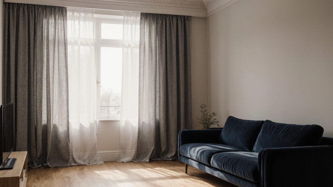
Take a living room with charcoal walls, a navy velvet sofa, and oak floors. You might think you need a bold curtain to match the sofa. But the truth? Warm gray linen curtains make the navy look richer. The oak looks warmer. The charcoal feels intentional, not heavy.
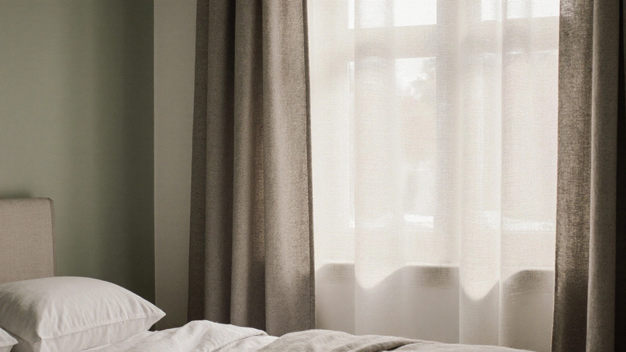
Or a bedroom with pale green walls and white bedding. Off-white curtains with a subtle weave let the green breathe. They don’t compete. They don’t distract. They just… belong.
Even in a tiny studio with mismatched furniture - a mid-century chair, a modern coffee table, a thrifted rug - soft taupe curtains tie it all together. No one notices them. But everyone notices how calm the space feels.
How to Pick the Right Shade for Your Space
Don’t pick a curtain color based on a swatch in the store. Bring home samples. Hang them. Live with them for a few days.
- Take a 12x12 inch swatch of your top three choices: warm gray, soft taupe, off-white.
- Hang them in the window at different times of day - morning, noon, sunset.
- Watch how they interact with your walls, floor, and furniture.
- Ask yourself: Does this make the room feel bigger? Lighter? Calmer?
- If you feel a tiny bit of relief - like the room finally stopped fighting you - you’ve found it.
Pro tip: Buy your curtains in the same lighting condition you’ll use them in. If your room gets afternoon sun, test the swatch at 4 p.m. That’s when the light is most revealing.
What About Blackout or Thermal? Can Neutrals Do That Too?
Yes. And they should. You don’t need to sacrifice function for beauty. Look for blackout curtains in the same neutral palette. Many brands now offer lined curtains in warm gray and off-white that block 99% of light - no black plastic backing, no visible seams. The lining is woven into the fabric, so the front looks like plain linen or cotton.
Thermal curtains? Same deal. Wool blends, cotton-linen hybrids, even recycled polyester with thermal backing - all available in the three universal colors. You’re not choosing between comfort and style. You’re choosing both.
Final Rule: Less Is Always More
The goal isn’t to match your curtains to your decor. The goal is to let your decor breathe. Neutral curtains aren’t about being invisible. They’re about being the quiet foundation that lets everything else shine.
Think of them like the perfect pair of jeans. They don’t scream. They don’t change with the season. But they go with everything. And once you’ve got them, you never have to worry about the next outfit.
Do white curtains go with everything?
No - pure white curtains often look too harsh or too cold. They reflect too much light, show dirt easily, and can clash with warm wood tones or dark walls. Off-white - with a hint of warmth - is the better choice. It’s softer, more forgiving, and works with almost any color scheme.
What’s the best curtain color for a small room?
Off-white or warm gray. Lighter neutrals make spaces feel bigger by reflecting natural light without overwhelming it. Avoid dark colors like navy or black, which absorb light and shrink the visual space. Stick to medium-light tones with a soft texture to add depth without heaviness.
Can I use patterned curtains if I want something universal?
Not really. Patterns - even subtle ones - become visual anchors. They demand attention and can clash with existing furniture or wall art. For curtains that go with everything, stick to solid colors. If you want texture, choose a fabric with a weave or nap, like linen or bouclé, not a printed design.
Are blackout curtains available in neutral colors?
Yes. Many brands now offer blackout linings in warm gray, off-white, and soft taupe. The lining is integrated into the fabric, so the front looks like a natural, textured curtain - no visible black backing. Look for terms like "light-blocking," "thermal-lined," or "room-darkening" in neutral shades.
Should my curtains match my walls or my couch?
No - and you shouldn’t try. Curtains shouldn’t match anything exactly. They should complement. Neutral curtains act as a bridge between your walls, furniture, and floor. If your walls are warm and your couch is cool, a warm gray curtain balances both. Matching creates a flat, static look. Complementing creates depth.
If you’re still unsure, start with warm gray. It’s the most versatile. It’s the color that quietly fixes everything - from outdated sofas to mismatched rugs. Once you hang it, you’ll realize you didn’t need a new couch. You just needed the right curtains.