What Is the 3 Color Rule in Interior Design?
The 3 color rule in interior design helps create balanced, calming spaces by using one dominant, one supporting, and one accent color. Learn how to apply it to any room for professional-looking results.
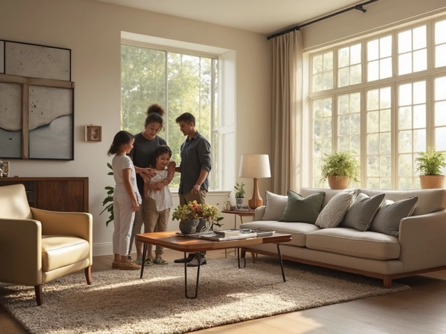
When you walk into a room and just feel at ease—like nothing’s off, nothing’s shouting, everything just fits—that’s design harmony. It’s not luck. It’s not expensive. It’s the quiet result of thoughtful choices in color, shape, scale, and flow. Design harmony, the balanced relationship between elements in a space that creates visual comfort and functional ease. Also known as visual equilibrium, it’s what turns a room full of stuff into a home that breathes. You don’t need a designer to get it. You just need to understand how things connect.
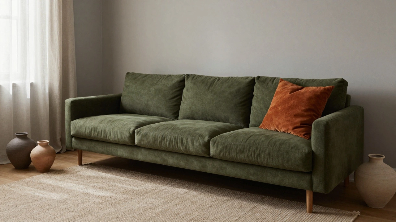
Think about color coordination, how hues interact to either calm or clash in a room. It’s not about picking the trendiest shade. It’s about how that color sits next to your sofa, your flooring, your lighting. That’s why warm neutrals and earthy greens keep showing up in posts—they don’t fight each other. They hold space. Then there’s space planning, the silent architecture of movement and function in a room. You can have the most beautiful rug in the world, but if it’s too small or too far from the couch, it feels wrong. That’s why coffee table distance matters. That’s why drawer placement on a coffee table isn’t just about style—it’s about ease. And furniture arrangement, how pieces are positioned to guide flow and create purpose? It’s not about symmetry. It’s about connection. A corner sofa doesn’t just sit in the corner—it invites conversation. A dining table centerpiece doesn’t just sit in the middle—it brings people together.
Design harmony doesn’t care if your style is modern farmhouse, minimalist, or cozy eclectic. It only cares if the pieces work together. That’s why floral wallpaper in 2025 isn’t about nostalgia—it’s about how the scale, color, and texture fit with your walls, your furniture, your light. That’s why beige is replacing gray—not because it’s trendy, but because it’s warmer, more forgiving, and plays better with wood, linen, and stone. That’s why you can’t just slap a bold rug in a small room and call it done. You have to think about how it connects to the curtains, the sofa, the ceiling height.
What you’ll find below isn’t a list of rules. It’s a collection of real fixes, real choices, and real rooms where design harmony actually happened. From stopping garden cushions from going mouldy to picking the right curtain color for every wall, these posts show you how small, smart moves add up to spaces that don’t just look good—they feel right. No fluff. No jargon. Just what works.
The 3 color rule in interior design helps create balanced, calming spaces by using one dominant, one supporting, and one accent color. Learn how to apply it to any room for professional-looking results.