Decor Rule: Your Go‑To Guide for Instantly Better Interiors
Ever walked into a room that just feels right and wondered what the secret is? Most of the time it’s a few simple decor rules that keep the space balanced, functional, and pleasing to the eye. Below you’ll find the must‑know guidelines that work for almost any home, whether you’re hanging art, picking sofa colors, or choosing floor finishes.
Wall Decor Rules You Can Apply Today
The easiest way to upgrade a room is by fixing the walls. Start with the “eye‑level rule”: the centre of a picture should sit about 57‑60 inches from the floor. If you’re creating a gallery wall, keep the spacing consistent – about 2‑3 inches between frames – and align the tops or bottoms for a clean look.
Next, think scale. A tiny canvas on a massive wall looks lost, while a huge piece can overwhelm a small space. Measure the wall, then aim for artwork that covers roughly two‑thirds of the width. Larger rooms can handle bigger statements; cozier rooms benefit from a cluster of medium‑sized frames.
Don’t forget lighting. A well‑placed wall sconce or directional spotlight draws attention to the art and adds depth. If you’re on a budget, position a floor lamp a few feet away to create soft, focused illumination.
Color & Furniture Rules for Cohesive Spaces
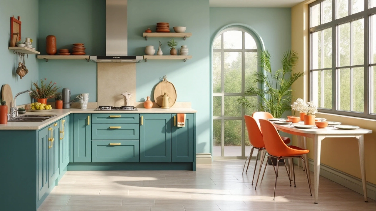
One common question is whether a sofa should be lighter or darker than the walls. The rule of thumb: if your walls are a bold, saturated hue, choose a neutral or slightly lighter sofa to tone it down. If the walls are light, a darker sofa adds contrast and anchors the room. This creates visual interest without clashing.
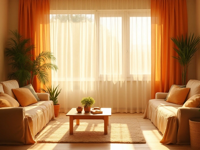
When mixing colors, stick to a 60‑30‑10 palette – 60% dominant, 30% secondary, and 10% accent. For example, use a neutral base for large items (walls, floor), a complementary secondary color for furniture, and a pop of accent through pillows or art.
Flooring can be a silent hero. Pick a color that works with both light and dark furnishings; warm greys or soft taupes fit most palettes and hide dust better than stark whites. If you love a bold floor, keep the rest of the room simple to avoid visual overload.
Finally, don’t forget function. A coffee table should be easy to reach from all seats – generally one‑hand length away. If you have a sectional, keep traffic pathways at least 3‑4 feet wide to prevent a cramped feel.
Apply these decor rules one by one, and you’ll notice a big difference without a full redesign. Hang your art at eye level, balance color contrast, and respect scale – the room will thank you. Need more specific advice? Check out our related posts on wall art placement, sofa colour decisions, and the best floor colors that go with everything. Happy styling!