Gray Replacement Color: Find the Best Alternatives for Your Interiors
When people talk about a gray replacement color, a neutral hue chosen to replace cool or flat gray tones in home interiors. Also known as warm neutral, it’s not about ditching gray entirely—it’s about upgrading it to feel more alive, more inviting, and better suited to natural light and real-life living. Many UK homes used to lean hard on cool grays, but over time, those shades started feeling cold, especially in rooms with limited sunlight. That’s why homeowners are turning to warmer, richer alternatives that still feel calm but don’t drain the energy from a space.
A good gray replacement color, a neutral hue chosen to replace cool or flat gray tones in home interiors. Also known as warm neutral, it’s not about ditching gray entirely—it’s about upgrading it to feel more alive, more inviting, and better suited to natural light and real-life living. Many UK homes used to lean hard on cool grays, but over time, those shades started feeling cold, especially in rooms with limited sunlight. That’s why homeowners are turning to warmer, richer alternatives that still feel calm but don’t drain the energy from a space.
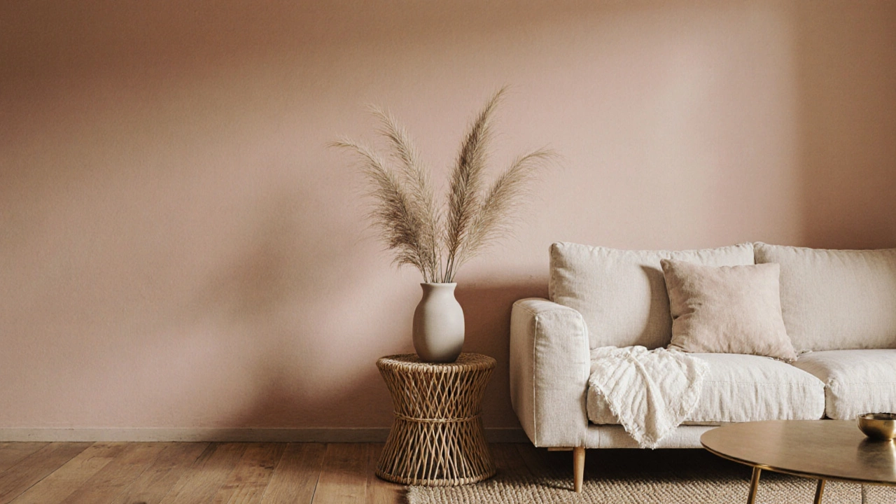
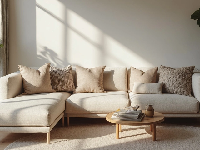
What works best? Think greige—a mix of gray and beige—that’s the top pick for living rooms and bedrooms. It pairs effortlessly with wood tones, linen fabrics, and dark metal finishes. Then there’s taupe, a muted brown-gray tone that bridges earthy and neutral palettes, which adds depth without heaviness, perfect for dining rooms where you want warmth but not drama. Soft beige, a light, warm neutral with subtle yellow or pink undertones is another winner, especially if you’ve got a lot of natural wood furniture or want to make a small room feel bigger. These aren’t trendy guesses—they’re the colors people actually use after living with gray for years and realizing it didn’t feel like home.
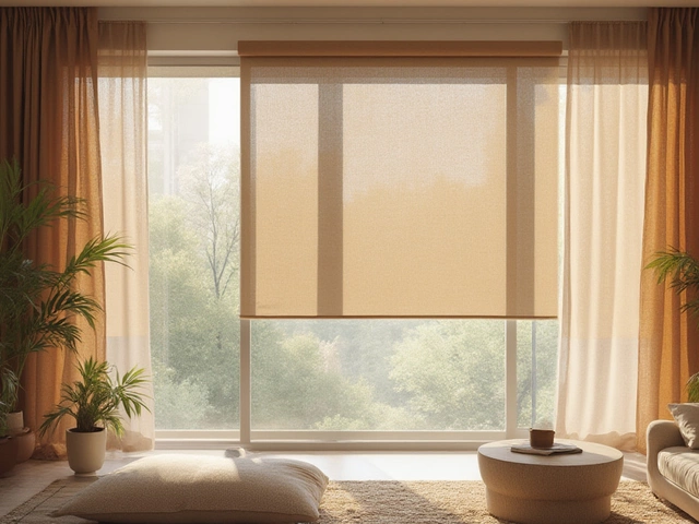
It’s not just about paint. The same logic applies to sofas, rugs, and even kitchen cabinets. If your gray sofa looks dull next to your oak floor, swapping it for a warm taupe or stone tone can instantly tie the room together. Same with flooring—if your gray tiles feel sterile, a light walnut or oiled oak can bring the whole space to life. The goal isn’t to go bold. It’s to go right—a shade that works with your light, your furniture, and your daily life.
Below, you’ll find real-world examples from UK homes that made the switch. Whether you’re replacing a faded wall, updating a worn-out sofa, or just tired of gray that looks like a hospital, these posts show you exactly what works—and what doesn’t. No theory. No fluff. Just what people actually did, and why it changed their space.