Color Selection Guide for 2024 Interiors
Select your room type to see the best 2024 trending colors for your space.
Bedroom
Kitchen
Living Room
Bathroom
Home Office
Warm Neutral
Oatmeal, Cream, TaupeEarthy Green
Forest Floor, Olive SprigDeep Blue
Hale Navy, Indigo NightSoft Terracotta
Adobe, Spice TrailWhen you walk into a room and feel calm, grounded, or quietly energized-it’s not just the furniture or the lighting. It’s the color. In 2024, interior design stopped screaming for attention and started whispering comfort. The big shift? Away from cold grays and sterile whites, toward colors that feel like they’ve been in your life for years, even if you just painted them yesterday.
Warm Neutrals Are the New Blank Canvas
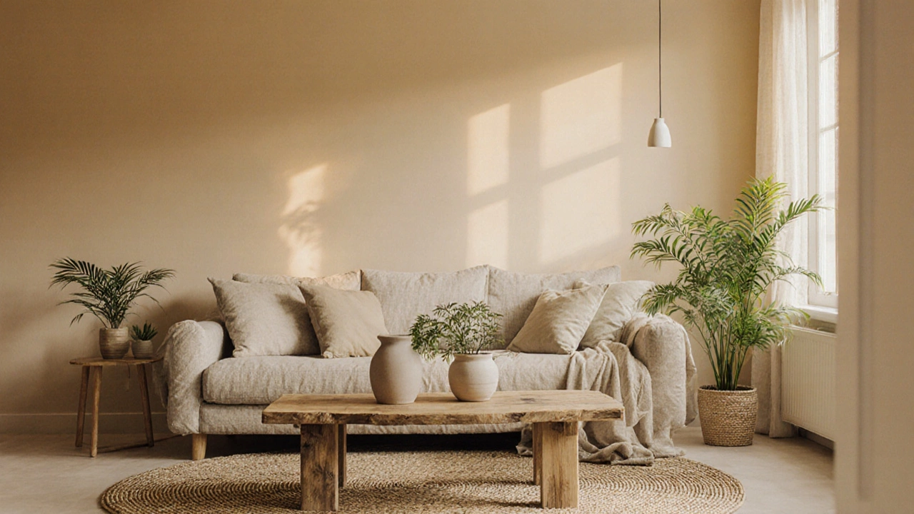
Forget pure white walls. In 2024, the go-to base isn’t white at all. It’s warm beige-the kind that leans into oatmeal, cream, or soft taupe. These aren’t flat, boring tones. They’re rich with subtle undertones: a hint of yellow, a whisper of pink, or a touch of gray that keeps them from feeling too sweet. Brands like Benjamin Moore’s Revere Pewter and Sherwin-Williams’ Agreeable Gray are still popular, but the real winners this year are the ones that feel hand-mixed, like Navajo White or Alabaster with a buttery glow.
Why this shift? People are tired of spaces that feel like showrooms. Warm neutrals make rooms feel lived-in, cozy, and timeless. They work with every style-Scandinavian, Japandi, modern farmhouse-and they don’t clash with wood tones, whether it’s dark walnut or light oak. In Wellington homes, where natural light can be soft and moody for months, these tones bounce what little sunlight there is and make spaces feel bigger without being cold.
Earthy Greens Are Everywhere
If you’ve noticed more homes with walls that look like they’re borrowed from a forest floor, you’re not imagining it. Deep, muted greens are dominating accent walls, cabinetry, and even ceilings. Think Forest Floor, Olive Sprig, or Evergreen Fog. These aren’t the bright, almost neon greens of the 2010s. These are colors that come from nature-moss, ferns, wet soil after rain.
Why now? After years of pandemic-induced isolation, people are craving connection to the outdoors. Green doesn’t just look calming-it feels grounding. In kitchens, it’s replacing white cabinets. In bedrooms, it’s the backdrop for linen bedding and rattan lamps. Even in small apartments, a single green wall creates depth without needing a lot of space. In New Zealand homes, where indoor plants are practically a requirement, green walls make the greenery feel like part of the design, not an add-on.
Deep Blues Are the New Black
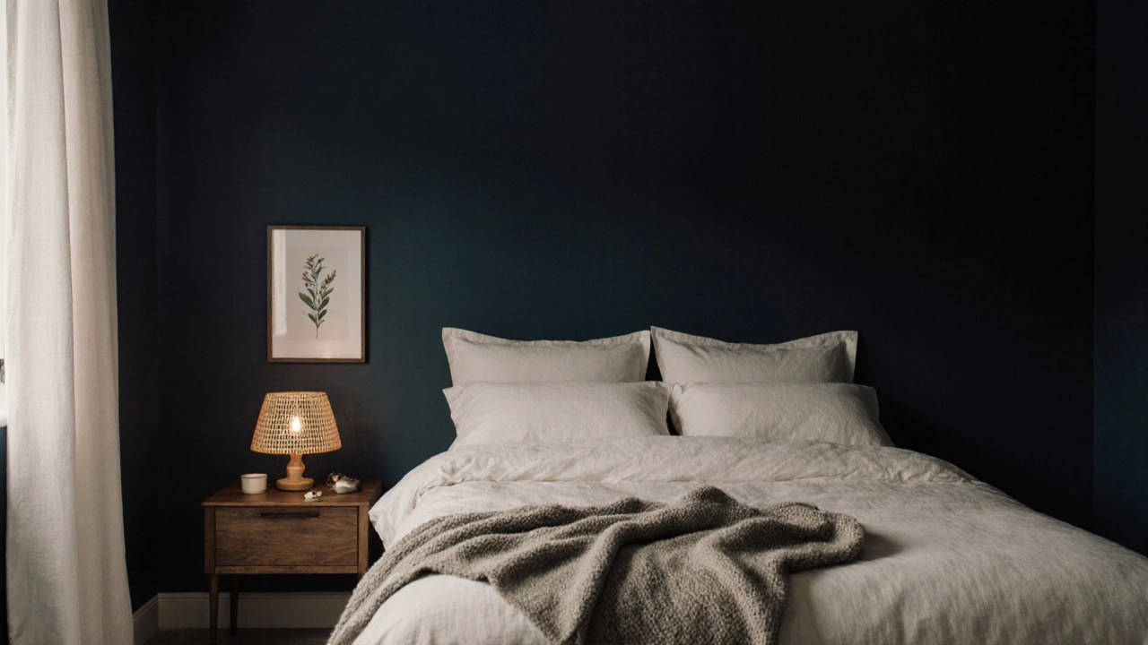
Black walls? Too harsh. Deep navy? Too cold. The 2024 answer is midnight blue-rich, warm, and surprisingly versatile. Think Hale Navy, Newburyport Blue, or Indigo Night. These aren’t just for dramatic living rooms anymore. They’re showing up in bathrooms, home offices, and even hallways.
What makes them work? Unlike black, which absorbs light and can feel oppressive, deep blue reflects it just enough to feel luxurious without being heavy. Paired with brass fixtures, creamy textiles, or warm wood, it creates a sense of quiet elegance. In bedrooms, it’s the perfect backdrop for sleep-it’s calming without being dull. In bathrooms, it makes white towels and marble countertops pop. And unlike gray, it doesn’t look dated after a year.
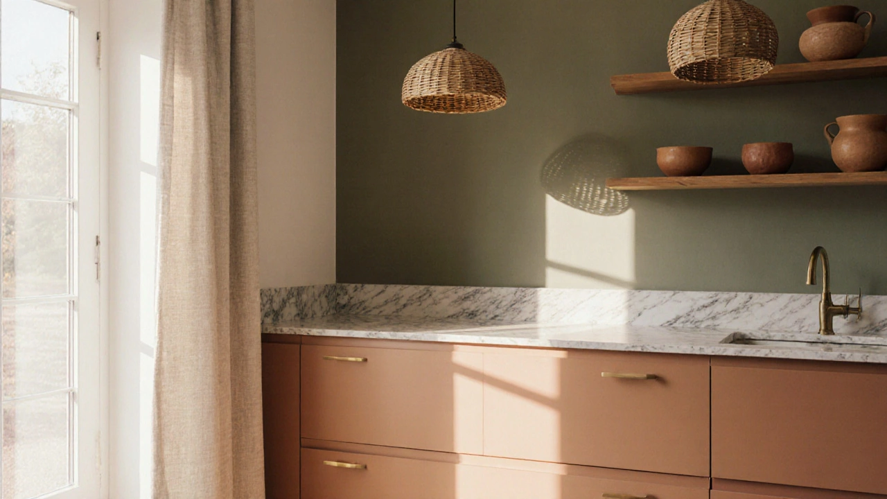
Soft Terracotta Is the Warmth We Didn’t Know We Needed
Remember the clay pots you used to keep on your balcony? That color is back-but in a refined way. Soft terracotta, the kind that looks like sun-baked earth, is now a main player in 2024 interiors. It’s not the bright orange-red of the 70s. It’s muted, dusty, and slightly pinkish-like Adobe, Spice Trail, or Clay Rose.
This color works because it’s both nostalgic and modern. It pairs beautifully with linen, rattan, and raw ceramics. It’s the perfect complement to warm neutrals and earthy greens. In kitchens, it’s showing up on backsplashes and open shelving. In living rooms, it’s on throw pillows and area rugs. It’s also one of the few colors that looks good in both natural and artificial light, which makes it ideal for homes that don’t get all-day sun.
Why These Colors Are Working Now
This isn’t random. These trends are a direct response to how people are living now. After years of remote work, hybrid schedules, and digital overload, homes aren’t just places to sleep-they’re sanctuaries. People want spaces that reduce stress, not add to it.
These colors all share one thing: they’re low-contrast and non-stimulating. That means they don’t trigger visual fatigue. A wall painted in deep green or warm beige doesn’t demand your attention. It lets you breathe. That’s why they’re replacing high-contrast palettes like black-and-white or bold primary colors.
There’s also a cultural shift toward sustainability. These colors are inspired by natural materials-clay, stone, wood, plants. They’re not about trends. They’re about timelessness. When you paint your walls with a color that looks like it came from the earth, you’re not chasing a fad. You’re building a home that feels permanent.
How to Use These Colors in Your Home
Start small. You don’t need to repaint every room. Try one accent wall in your bedroom or a piece of furniture in terracotta. Test paint samples on different walls and observe them at different times of day. Light changes everything.
- For small rooms: Use warm beige on all walls. It opens up space without feeling sterile.
- For a cozy reading nook: Paint one wall in deep blue. Add a cream armchair and a wooden side table.
- For a kitchen refresh: Swap white cabinets for soft terracotta. Keep countertops light to balance it.
- For a modern look: Pair earthy green with matte black hardware and white linens.
Don’t forget textures. These colors work best with natural materials-linen curtains, wool rugs, unfinished wood, stone countertops. A flat, glossy finish can make even the softest color feel cheap.
Colors to Avoid in 2024
Not all neutrals are in. Cool grays with blue undertones? Still hanging on, but fading fast. They make rooms feel clinical, especially in winter. Bright whites? They’re out unless they’re mixed with a warm base. And neon accents? They’re back only in art, not on walls.
Also avoid overly saturated colors unless they’re used sparingly. A single mustard yellow pillow is fine. A whole mustard yellow living room? That’s a 2015 throwback.
What Experts Are Saying
According to the Pantone Color Institute’s 2024 report, the top three paint colors reflect a global desire for "emotional resilience." That’s code for: people want calm, not chaos. The same goes for Sherwin-Williams’ 2024 Color of the Year-Wheat Grass, a soft green-beige that blends earth tones with quiet warmth. It’s not flashy. It’s not loud. But it’s the color people keep coming back to.
In New Zealand, local designers are seeing a spike in requests for colors that match the landscape-muted greens for the bush, warm beiges for the coast, soft terracottas for the volcanic soil. It’s not about copying nature. It’s about feeling connected to it.
Final Tip: Don’t Overthink It
The best color for your home isn’t the trendiest one. It’s the one that makes you feel at ease. If a deep blue wall gives you peace every time you walk in, that’s your color-even if it’s not on every Pinterest board. Trends come and go. Your comfort doesn’t.
Paint a small section. Live with it for a week. See how it changes with the light. Then decide. You don’t need permission from Instagram to make your home feel like yours.
What are the most popular wall colors for 2024?
The most popular wall colors in 2024 are warm beige, earthy green, deep navy, and soft terracotta. These tones are chosen for their calming effect, versatility, and connection to natural materials. They work well in both modern and traditional homes and suit different lighting conditions.
Are neutral colors still in style in 2024?
Yes, but not the cool, gray-based neutrals from the past decade. Warm neutrals-like oatmeal, cream, and taupe with yellow or pink undertones-are now the standard. They feel more inviting, especially in homes with limited natural light.
What color is best for a small bedroom in 2024?
Warm beige is the top choice for small bedrooms. It reflects light gently, makes ceilings feel higher, and pairs well with wood tones and natural fabrics. Avoid cool grays or stark whites-they can make the room feel smaller and colder.
Should I paint my kitchen cabinets in 2024?
If you’re updating your kitchen, consider soft terracotta or earthy green. These colors add warmth without overwhelming the space. Pair them with light countertops and matte brass hardware for a modern, grounded look. White cabinets are still common, but they’re no longer the default.
How do I test paint colors before committing?
Buy small sample pots and paint large swatches (at least 2x2 feet) on different walls. Observe them in morning, afternoon, and evening light over several days. Also, place a white sheet of paper next to it-this helps you see the true undertone. Don’t rely on paint chips alone-they’re misleading in store lighting.