What Is the 3 Color Rule in Interior Design?
The 3 color rule in interior design helps create balanced, calming spaces by using one dominant, one supporting, and one accent color. Learn how to apply it to any room for professional-looking results.
When it comes to interior design, the 3 color rule, a design principle that limits a space to three main colors for visual harmony. Also known as the 60-30-10 rule, it’s not about being restrictive—it’s about being intentional. Too many colors make a room feel messy. Too few make it flat. The 3 color rule strikes the balance by giving you structure without sacrificing personality. This isn’t some old-school rule from a 1980s design magazine. It’s used by top interior stylists today because it works—especially in homes where you want calm, cohesion, and character without spending a fortune.
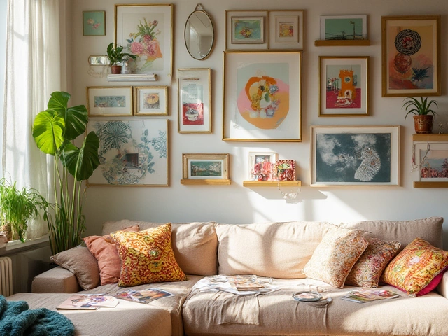
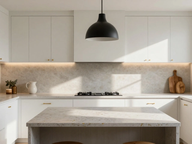
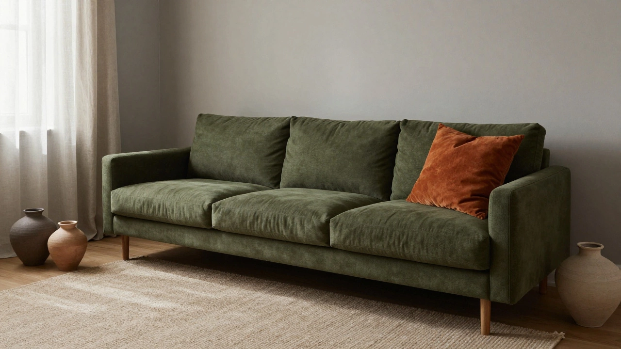
Think of it like building a wardrobe. You need a base color—your neutrals—that takes up about 60% of the space. Think walls, large rugs, or built-ins in warm grays, soft beiges, or muted taupes. Then comes your secondary color—30%—usually your main furniture or window treatments. That’s where you bring in navy, olive green, or charcoal. Finally, your 10% accent color pops in: a throw pillow, a lamp, or artwork. Maybe it’s terracotta, mustard, or even a deep teal. These aren’t random picks. They’re chosen to complement each other, not compete. You’ll see this exact pattern in the posts below: how a white corner sofa pairs with navy and earth tones, why neutral curtains work with almost everything, and how beige replaced gray as the go-to neutral in 2025. All of it follows the same quiet logic.
What makes the 3 color rule, a design principle that limits a space to three main colors for visual harmony. Also known as the 60-30-10 rule, it’s not about being restrictive—it’s about being intentional. so powerful is that it scales. It works in a tiny bathroom with one wall painted deep green and the rest in off-white. It works in a large living room with a bold rug, a neutral sofa, and a single statement chair. It even works in outdoor spaces—think cushions in two tones and a single accent planter. The posts here show real examples: how to pick curtain colors that match everything, why certain bathroom palettes feel calming, and how to make a living room pop with just one bold move. You don’t need a designer to do this. You just need to know which colors to pick, where to put them, and when to stop.
What you’ll find in the collection below isn’t theory. It’s what people are actually using in their homes right now. From the shift from gray to beige as the dominant neutral, to how floral wallpaper is being styled with restrained palettes in 2025, to why a coffee table’s height and placement matter more than you think—all of it ties back to this simple idea: less color, more control. No more guessing if a pillow clashes. No more staring at a wall wondering why it feels off. The 3 color rule gives you a framework that’s flexible enough to fit your style, tight enough to keep things looking intentional. And that’s why it never goes out of fashion.
The 3 color rule in interior design helps create balanced, calming spaces by using one dominant, one supporting, and one accent color. Learn how to apply it to any room for professional-looking results.