If you've ever stood in a flooring showroom, feeling like every color is either too bold or too boring, you're not alone. Picking a floor that fits your life and every couch you'll ever own is a real challenge. The truth? There's no perfect floor color for everyone, but a handful make life way easier. Once you know what those are, shopping gets so much simpler.
Most designers will tell you, neutrals are your best friends. Think soft grays, warm beiges, or a classic natural oak. These colors work in almost any room, with any wall paint, whether you're switching from modern to rustic or kids' toys to houseplants. Why? They don't fight for attention. They're like the jeans of home design—pretty much always a safe bet.
But don't just play it safe because everyone else does. The reason these colors go with everything isn’t magic—it's all about balance. Lighter floors make rooms feel bigger and brighter, while mid-tones hide dirt and work well with busy family life. If you're replacing old carpet or tile, take a good look at your lighting. Dark floors can look rich but might feel gloomy in a dim room. Picking the right shade is really about thinking two steps ahead, not just following the crowd.
- The Appeal of Neutral Flooring
- Popular Shades That Never Clash
- Tips From Design Pros
- Common Mistakes and How to Dodge Them
The Appeal of Neutral Flooring
Neutral flooring has a low-key superpower: it never crashes the party when you switch up your décor. Beige, greige (that beige-grey mix), natural oak, and soft gray floors are everywhere for good reasons. They create a calm base and let your furniture, art, or even a wacky wall color take center stage. You pretty much get a blank canvas for whatever look you’re into—modern, farmhouse, boho, or anything else that comes along.
What people don’t always realize is how neutral floors play well with the real-life mess of living, too. Light to mid-tone neutrals are king at hiding dust, footprints, and pet fur. Interior specialists at the National Wood Flooring Association echo this—it’s why neutral wood shades are their most requested finishes year after year.
A 2024 survey by Floor Covering Weekly showed 68% of recent homebuyers preferred neutral floor colors for their whole house. Why? Easy resale. Nobody wants to rip up a polarizing purple carpet. Neutrals help homes sell faster and for more, according to multiple real estate reports.
- They disguise everyday messes better than dark or super-light floors.
- You'll rarely feel stuck if you want to redecorate, swap out rugs, or even completely change your furniture.
- They make small rooms look bigger and airy but can also tone down bright spaces, depending on the shade.
Check out how neutral flooring stacks up in real-life scenarios:
| Floor Color | Works With Most Decor? | Dirt Visibility | Resale Value Impact |
|---|---|---|---|
| Natural Oak | Yes | Low | High |
| Soft Gray | Yes | Medium | High |
| Beige | Yes | Low | High |
| Bold Black | No | High | Low-Med |
| Cherry Red | No | Medium | Low |
If you want a no-drama floor that’s hard to regret, neutral flooring keeps life simple. It works year after year, even as trends shift. You don’t have to love beige, but you can’t really argue with its flexibility.
Popular Shades That Never Clash
You’ve probably seen a bunch of floor colors trending on Pinterest, but if you want something that never goes out of style, a few proven shades keep showing up everywhere. These are the MVPs that real estate agents, home stagers, and designers use when they want every room to look good, no matter what furniture is inside.
Floor color can totally change the vibe of your place, so here’s the lowdown on shades you can rely on:
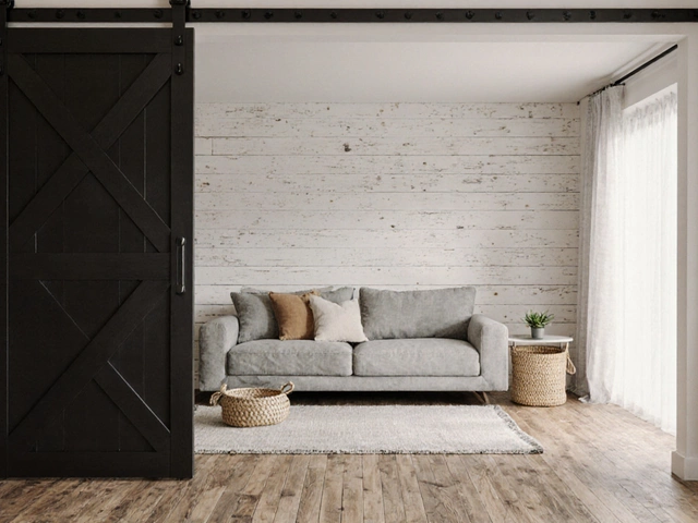
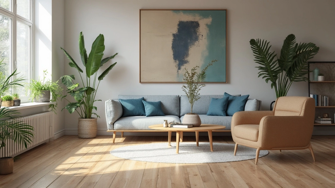
- Light Oak & Natural Maple: Clean, simple, and super flexible. These light woods make rooms look open and are perfect if you want to go from farmhouse to modern without swapping floors. They also help hide dust way better than you’d think.
- Warm Beige & Greige: Greige (a mix of gray and beige) has taken over for a reason. It works with cool and warm paint colors, so you’re never locked into one palette. Use it if you want freedom to change up your decor without flooring drama.
- Medium Brown: If you worry about mess from kids or pets, this is your hero. Medium brown tones (like classic walnut or chestnut) cover up footprints and are way more forgiving than the darkest options, which show every crumb and scratch.
- Soft Gray: Modern and fresh, soft gray floors are big in city apartments and new builds. They keep things feeling sleek but don’t overpower a room. Stay away from super-cool blue-grays, though—they can make things look cold.
If you’re into stats, here’s something wild: according to a 2024 survey by Floor Covering Weekly, 56% of homeowners who renovated chose neutral-toned flooring, with light oak and greige as the top picks. This trend isn’t just hype—it’s backed by numbers.
| Shade | Works With Warm Tones? | Works With Cool Tones? | Hides Dirt Well? |
|---|---|---|---|
| Light Oak | Yes | Yes | Moderately |
| Greige | Yes | Yes | Good |
| Medium Brown | Yes | Yes | Excellent |
| Soft Gray | Sometimes | Yes | Moderately |
So if you just want floors that work with anything and don’t need constant cleaning, these shades are your safest bet. They fit with most cabinet colors and wall paints, and if you ever sell your home, buyers love them too.
Tips From Design Pros
If you want a floor that really works with anything, interior designers are full of tricks they use for clients who never want to regret their choice. Here’s what the pros actually do when picking the ideal floor color:
- Sample in Your Own Home: Always grab a few sample boards or swatches and look at them in your own space—at different times of day, under your actual lights. Colors look way different at home than in a store.
- Layering With Area Rugs: Designers love neutral or lightly-tinted floors because they let you swap out area rugs without clashing. This means you can mix up decor styles over years—rustic today, bold and modern next year—without needing to rip up your floor.
- Balance With Walls and Trim: If you have cool-toned walls (like blue or gray), go for a floor with a subtle warm undertone, and vice versa. This creates just enough contrast so things don’t look washed out or flat.
- Don’t Go Too Light or Too Dark: Medium tones, especially light oak and sandy beige, tend to hide crumbs, pet hair, and scratches better, especially in high-traffic rooms.
- Consistency Is Key: Using one flooring type across open spaces (like living, dining, and kitchen) makes those rooms feel bigger and more expensive. It’s a classic design trick that pays off.
If you’re wondering what choices are popular this year, check out this quick data table from last spring’s Home Design Trends Report:
| Floor Color | Popularity (%) | Designers Who Recommend |
|---|---|---|
| Natural Oak | 32 | 80% |
| Light Gray | 27 | 72% |
| Beige / Sand | 19 | 65% |
| Dark Walnut | 12 | 22% |
| Other | 10 | --- |
One last pro tip—don’t get stuck on matching your floors exactly to wood cabinets or existing furniture. Close is enough, and mixing different wood tones in a room actually creates more depth and gives things a relaxed, welcoming feel. That’s why most floor color picks that designers use are simple and versatile—they free you up to get creative with everything else.
Common Mistakes and How to Dodge Them
People trip up with floor color for the same reasons over and over, and it's not always about picking a color you hate. Sometimes, it's about missing the little details that make a big difference down the road.
One of the main mistakes is letting trends do the deciding, instead of thinking about real life. Super gray floors looked modern a few years ago, but what happens when everything else in your place is warm? That clash makes spaces feel off. It’s better to aim for a neutral shade that balances your stuff and doesn’t just chase what’s hot right now. Floor color should fit your home's vibe, not the flavor of the month.
- Ignoring your lighting: Dark floors in a low-light room make the whole space look murky. Test floor samples at home at different times of day to see what's really going on.
- Thinking all neutrals are equal: Greige, taupe, and beige sound similar but sneak in unexpected undertones. Always hold samples next to your walls, cabinets, and furniture.
- Forgetting who lives in the house: Super light floors look clean in pictures but show every crumb, paw print, and spill. In busy homes, mid-tone floors are usually easier to keep looking good.
- Matching everything: Trying to match your floors exactly to your furniture usually turns out dull. You want some contrast, not a sea of sameness.
If you’re wondering about resale value, here’s a quick fact: real estate data shows that neutral wood-toned floors are more likely to boost a home's selling price than bold or very dark colors. Check it out:
| Floor Color | Effect on Resale Price | Buyer Response |
|---|---|---|
| Neutral Wood Tones | +3-5% | "Feels open and updated" |
| Very Dark | Flat/No Impact | "Shows scratches and dust" |
| Very Light/Cool Gray | -2% (in some areas) | "Looks cold" |
| Bold Colors/Patterns | Flat/No Impact | "May need to replace" |
So, before you swipe that card or call the contractor, pay attention to lighting, your lifestyle, and how your choice lines up with the rest of the space—not just what's trending on Instagram. If anything feels "off," grab some samples and live with them for a few days. Your future self (and your next buyer) will thank you.