Wall Art Balance Calculator
Room Configuration
Adjust inputs to see recommendations.
Walk into a room that feels like a museum archive, and your eyes immediately start darting around. There’s no resting place. Now walk into a stark white box with a single painting hanging dead center. It feels cold. Somewhere between these two extremes lies the sweet spot of wall art. But how do you find it without guessing?
The question isn't just about taste; it's about psychology and spatial dynamics. We often hang art because we love the pieces, not because they serve the room. This leads to what designers call 'visual noise.' When every inch of wall is covered, the brain can’t prioritize what to look at. Everything becomes background. Nothing stands out.
The Psychology of Visual Space
Your brain processes images faster than text. In a room filled with ten different frames, patterns, and colors, your cognitive load increases. You feel stimulated, yes, but also slightly anxious or overwhelmed. This is why minimalist spaces often feel calming-they give the eye permission to rest.
Consider the concept of 'negative space' in design. Negative space isn't empty; it's active. It defines the shape of the objects around it. If you cover all the negative space with art, you remove the definition. The walls stop being a backdrop and become a competitor for attention. A good rule of thumb? Aim for 60-70% wall coverage if you’re going heavy, leaving 30-40% bare to let the art breathe.
Think about your favorite restaurant. Does it have a gallery wall in every corner? Probably not. It has one focal point-a large mirror, a statement piece, or perhaps a textured wallpaper. The rest is quiet. That contrast makes the focal point memorable.
Room-by-Room Breakdown: Where Art Thrives and Fails
Not all rooms are created equal. The function of a space dictates how much art it can handle before it feels cluttered.
| Room | Recommended Coverage | Primary Goal |
|---|---|---|
| Living Room | Medium (40-50%) | Social engagement & conversation starters |
| Bedroom | Low (20-30%) | Relaxation & sleep hygiene |
| Dining Room | Medium-High (50-60%) | Atmosphere & stimulation during meals |
| Home Office | Variable (Focus vs. Inspiration) | Mental clarity or creative spark |
| Hallways | High (60-80%) | Visual interest during transit |
In the bedroom, too much art can disrupt sleep. Bright colors and complex compositions keep the mind alert. Stick to serene landscapes, abstract soft tones, or keep the walls mostly bare. In contrast, hallways are perfect for gallery walls. Since people don't sit there, their eyes naturally scan the environment as they walk. A dense collection works well here because it breaks up long, boring corridors.
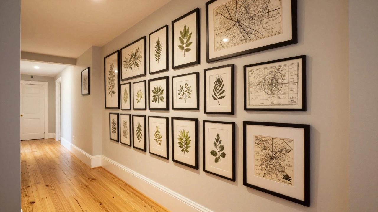
The Gallery Wall Trap: Cohesion vs. Chaos
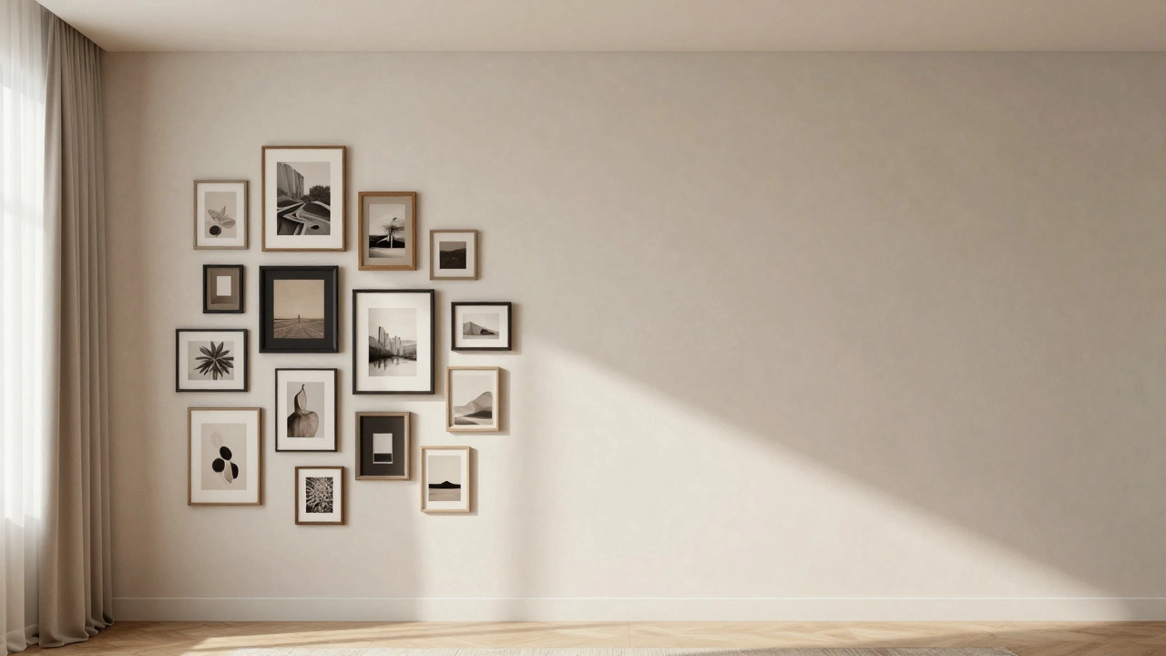
A gallery wall is the most common way people accidentally create 'too much' art. The mistake isn't the number of pieces; it's the lack of cohesion. If you hang five photos with black frames, three with gold frames, and two canvas prints with no mats, you haven't created a collection. You've created a flea market stall.
To pull off a dense arrangement, you need unifying elements. Here are three strategies:
- Uniform Frames: Use the same frame style and color across all pieces. This creates a grid-like structure that calms the eye.
- Consistent Color Palette: Even if the subjects differ, ensure the dominant colors in the art share a family (e.g., all earth tones, or all monochrome).
- Thematic Link: All botanical prints, all travel photography, or all vintage maps. The theme provides context, making the density feel intentional rather than random.
If you mix styles, sizes, and themes without a strong anchor, the wall will feel chaotic. Ask yourself: "Does this group tell a story?" If the answer is no, remove half the pieces.
Scale and Proportion: The Silent Killer of Good Design
One of the biggest reasons walls feel cluttered is incorrect scaling. Hanging four small 8x10 photos above a large sofa doesn't work. The furniture dominates the space, and the tiny art looks lost, prompting you to add more pieces to fill the void. This cycle creates clutter.
Instead, think in terms of mass. A large sofa needs substantial visual weight above it. One large piece (36x48 inches or larger) often looks better than six small ones. Large art commands attention and reduces the need for additional decorations. It acts as an anchor.
Conversely, in a small nook with a narrow console table, one massive painting might overwhelm the space. Here, a vertical stack of two or three medium-sized pieces works better. Always measure your wall space first. Leave at least 6-8 inches of breathing room between the top of the furniture and the bottom of the art.
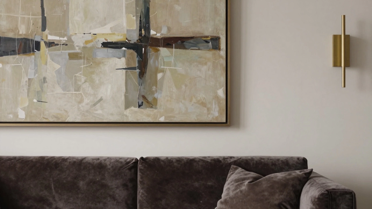
Lighting and Texture: Alternatives to More Art
If you feel a wall is 'empty' but adding another print feels wrong, consider other dimensions. Lighting changes how we perceive space. A sconce next to a single piece of art adds depth and shadow, making that one piece feel more significant.
Texture is another powerful tool. A woven tapestry, a wooden slat panel, or even a painted accent wall can provide visual interest without the cognitive load of interpreting an image. These elements add warmth and character without competing for narrative focus.
Remember, art is meant to be seen, not just displayed. If you have so much art that guests never notice any specific piece, you’ve gone too far.
Practical Checklist: Do You Have Too Much Art?
Stand back from the wall. Take a deep breath. Ask these questions:
- Can I identify the focal point within 3 seconds?
- Do my eyes feel tired after looking at the wall for 10 seconds?
- Are there more than three different frame styles visible?
- Is there less than 2 inches of wall space between individual pieces?
- Does the art clash with the room's primary function (e.g., stimulating art in a bedroom)?
If you answered 'yes' to more than two of these, it’s time to edit. Remove pieces until the answers shift to 'no.' Trust me, your room will thank you.
How many pictures should I hang on one wall?
There is no fixed number, but generally, 3 to 5 pieces create a balanced composition for an average living room wall. For smaller spaces like entryways, 1 to 3 pieces are ideal. The key is ensuring the total area of the art covers about 60-75% of the available wall space behind the furniture, not the entire wall.
Is it bad to have too much art in a small apartment?
Yes, it can make a small apartment feel cramped and chaotic. In small spaces, fewer, larger pieces often work better than many small ones. Large art draws the eye upward and outward, creating an illusion of space. Cluttering walls with numerous small items shrinks the perceived size of the room.
What is the best height to hang art?
The standard museum height places the center of the artwork at 57 inches from the floor. This aligns with average eye level. If hanging art above a sofa or console, leave 6-8 inches of space between the top of the furniture and the bottom of the frame. This prevents the art from feeling crowded against the furniture.
Can I mix framed art with other wall decor?
Absolutely, but maintain consistency. Mixing framed photos with mirrors, clocks, or shelves can work if they share a similar aesthetic (e.g., same metal finish or wood tone). Ensure there is enough spacing between different types of decor to avoid a messy look. Treat the entire wall as a single composition.
How do I know if my gallery wall is cohesive?
A cohesive gallery wall has a unifying element. This could be matching frames, a consistent color palette across all prints, or a shared theme (like nature or architecture). Step back and look at the wall. If your eye jumps randomly without finding a pattern, it lacks cohesion. Add uniformity through frames or mats to tie disparate pieces together.